

With 8+ years of experience designing digital products, I’m a generalist with a positive can-do attitude. I enjoy making things simpler, working on products end-to-end, and I always try to have a reason behind the design decisions I make.
Based in
Cork (Ireland),
outside of work I’m always experimenting with side projects (thank you AI!).
Hiring?
Yay, I'm open to opportunities!
What I'm looking for
I'd love to join a small, informal team with some impossible mission. I'd like to:
be involved in strategy and product thinking, not just visual execution
contribute to the codebase (with AI-assisted code), working directly with devs
be in touch with users/researchers
have ownership over what I work on and be proud of what we put out in this world
have fun
I don't care much about roles, hierarchy or career ladder, I do care about working on a high quality, useful product, with a good team.
Case studies
Personal projects
Coming soon
The making of Bluebie
TL;DR
A retro-pixel grocery-list app I designed, branded and built solo (icons, copy, animations, PWA and all), mostly for fun, to see what I could ship end-to-end with Claude as my only teammate.
Bluebie is a mobile app to manage your grocery list, with a retro-pixel aesthetic.
Why?
There’re plenty of apps for lists, most of them are very standard, kinda boring, some have ads, or are paid. I wanted one that would bring me some joy when doing groceries, and I wanted to test what I could single-handedly do with Claude. Also, for the glory, I hadn't made a mobile app before.
Sweating the details
I wanted a videogame feel, but not too much, to avoid people actually thinking it’s a videogame when seeing it in the Store.
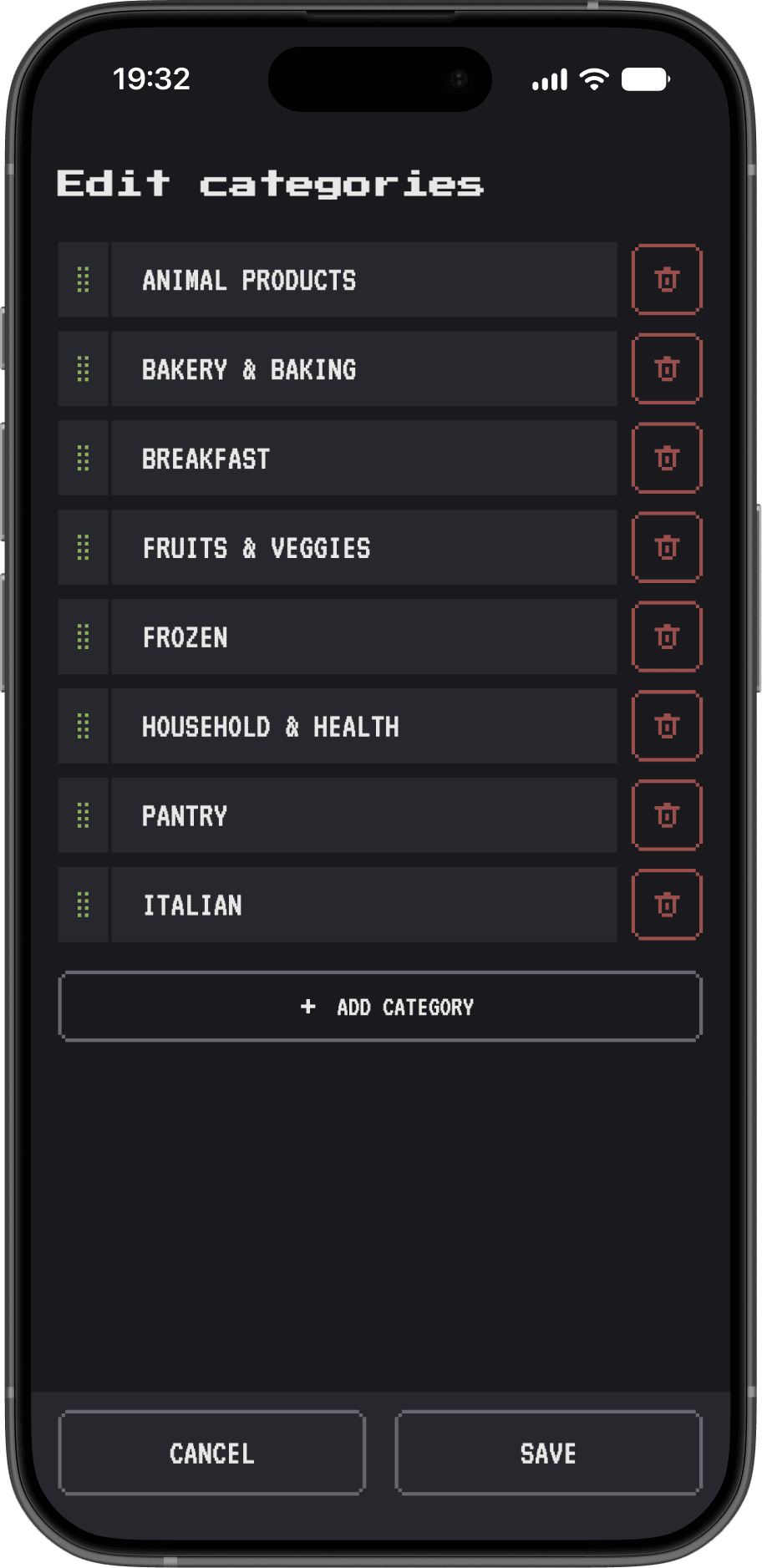
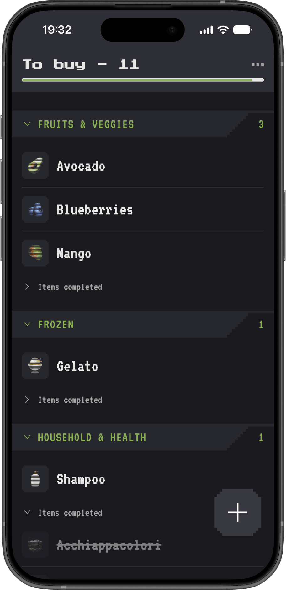
Some screenshots
Some copy examples and the animation on delete
At first I wanted to create the visuals for list items in a pixel art style, but I realized I can’t know all the possible items people would have in their lists. So after looking for pixely filters, I landed on a less-appealing but more scalable solution: simply using native emojis, with some CRT-like lines to give the retro feeling.
Icons I wanted to use vs icons I ended up using
To surprise and reward my partner for buying distasteful but healthy food (looking at you, salad), or very good ones, I added a way to spark some joy when checking items. Our household registered a +25% increase on carrots monthly spending.
Yaay!
The items editing actions are revealed on horizontal drag, like in Gmail and many common apps. But after spending a good minute observing a friend pressing and waiting in confusion for something to happen, I added a long press interaction in addition to the drag.
Press, drag, both works!
UX choices
The main value of Bluebie lies in creating a whole list of the items you recurrently buy, and reusing it over and over, so you just create the items once. As it can be annoying to add one item at a time, I added a quick list setup. And for those adding items manually, I added a predefined emoji for the most common items, so that those emojis are automatically added after the user types the item name.
Auto-emoji insertion, isn't it magical?
Process & technicalities
It took a few months, working a few hours in the weekends, with me, myself and AI.
It was one of my first projects where Figma was mostly a sketch pad for ideas and not polished mockups. I used Pixquare for the pixely icons, and Claude for coding.
Technically, it’s a PWA, using Firebase for storing the lists, Google auth for accounts, and Vercel for hosting.
Branding
Bitlist, Pixlist, Baskit, Stakit, Grabit, Blooli, Bloopi, Blubi, Bluet, Bluva, Bloobit, Bloomi, Berrly, Bluebit… I spent quite some time on the naming, brainstorming with ChatGPT and its horribly generic suggestions, until we finally focused on something that would fit the blueberry app icon. We landed on a made-up word, with a very cute sound (imho), verified that the domain was available, the competition space clean enough, and off we go: Bluebie!
Easter egg
In a couple of screens there're some floating icons (the pixely ones I didn't use for the list items). If you click or long-press on them, they'll respond you.
The redesign of Infogram dashboard
TL;DR
A ground-up rework of Infogram's dashboard information architecture, from user-interview findings and prototyping through AB testing and a shipped redesign. Spearheaded end to end, from research to release planning.
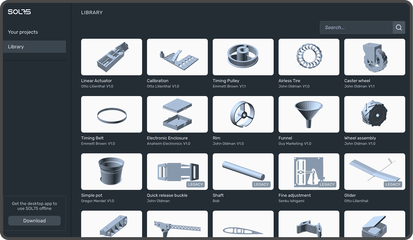
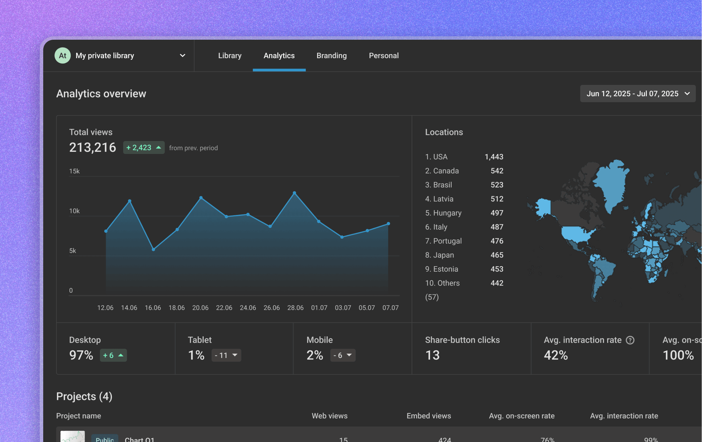
Before & after
Infogram is a web platform for creating data visualizations. It's built for people who need to turn data into something visual and interactive: journalists, marketers, and communications specialists creating reports, infographics, articles, and presentations.
Context
Infogram started in 2012 as a simple platform, with one library to see your projects, one template page to pick a design, and one editor to work on it. Over the years it grew, with more pages, more features, until it became a fairly complex tool, with two editors, analytics, branding, collaboration, five price tiers, four different user roles per team... you get the idea.
With growth came a less-than-ideal information architecture in the dashboard (aka everything outside the Editor). It got confusing enough that even the team would sometimes lose track of where a setting lived. Some options were so buried that users didn't know they existed at all. This was particularly experienced by Admins: users in higher paying plans who manage teams and usually have high influence on whether to renew their Infogram subscription.
Exploration
In 2023, while running user interviews for unrelated features, I started collecting side notes on evidence of confusion around several parts of the dashboard. I then prepared an internal presentation with the findings, to propose a redesign initiative. Here are some of the issues identified:
Folders were the main way for users to organize their content, but they were not given an equally important real estate, and were hard to reach on smaller screens.
The presentation also included an analysis of information architecture and a couple of proposals. One with vertical tabs in all pages, close to the existing layout, and one with a horizontal navigation.
A horizontal navigation allows more space for the folders and projects used by all users, while moving sections like Analytics and Branding, used only by Admins, into a secondary position.
Waiting…and testing
That initial presentation was well received, but with other initiatives taking priority, the PM, EM, and I agreed to postpone it to a better time.
By May 2025, that better time had not arrived yet due to other emergencies (we were without a PM, and AI had stormed into the roadmap), but more reasons to work on the dashboard had piled up:
Performance: users with hundreds of projects were experiencing slow library load times.
I made some time for creating a couple of prototypes with the main flows and gathered feedback from across the team: developers, customer success, customer support, QA, and Prezi design team. After a few iterations, I involved our UX researcher to set up qualitative tests in Lyssna to validate the new dashboard architecture and have data for when we would have time for it. We ran an AB test with a series of small tasks to complete on either the current or new dashboard, targeting existing admin users recruited through customer success.
The main goals were to:
Confirm that the new dashboard was faster to navigate, and that both new and moved flows (like the Organization section, team switcher, and profile) were easy to discover.
Check how the new look and feel would be received
Spot potential issues we hadn't anticipated
The first rounds surfaced one recurring issue: each of the three workspaces (Personal, Team, and Organization) had a menu item labeled "Settings," so users assumed it was the same everywhere. In reality, each workspace's settings held different content, so we relabeled them to make the distinction clear. Everything else showed no major issues.
Planning
During the summer of 2025, better times had finally arrived, and we kicked off development.
I started working closely with Aleksejs, the developer most passionate (and annoyed) by the existing dashboard issues. His experience with how things worked (or not) under the hood was fundamental to designing the final screens.
As engineers began the work, I prepared a Mitzu dashboard to keep an eye on the upgrade buttons (not because we expected an increase, but to make sure we weren't breaking anything), while also preparing high-fidelity screens, going deep into flows and documenting UI details. Here are a few:
Documenting team switcher states, scroll behavior, and spacing details
As I was spearheading the initiative, I also defined the release plan, which started when development was almost complete:
The four-week phased release plan, from admin interviews to full release
Outcome
We barely made it in time to complete and release the dashboard, when the company strategy changed and the team and I were moved from Infogram to building Swoop. What I could gather a few months later was that the previously hidden sections became more discoverable, with +12% YoY clicks on the top menu. Navigating the dashboard felt noticeably faster overall, and I'm confident Admins have an easier time managing their organizations. I'd love to confirm the impact with a drop in Customer Success and Support tickets related to navigation, but we don't have that data. So this is where my Infogram adventure ended, but I'm happy we left it in a better state.