Simplifying Infogram dashboard for Admins
- Years of growth left Infogram’s dashboard information architecture confusing. Even the team lost track of where some settings lived, and users with an Admin role in particular struggled to manage their organizations.
- Team
-
- 1 product designer and de facto PM (me)
- 3 engineers
- 1 UX researcher
- 1 QA
- My role
-
- Spearheaded the initiative end-to-end
- Identified the opportunity
- UX/UI
- Participated in user interviews
- Prepared AB testing and release planning
- Impact
-
- +12% YoY discovery of core sections (Analytics and Branding)
- More normal and easy to navigate architecture
- Noticeably faster loading library
- Cleaner and modern-looking UI
- Future-ready, for potential branding and AI evolutions
- Happier developers (and designer too!)
Problem
Context
Infogram is a web platform for creating data visualizations, with 5M+ users. It’s mostly B2B, though it does have B2C customers too, built for people who need to turn data into something visual and interactive: journalists, marketers, and communications specialists creating reports, infographics, articles, and presentations, at organizations like Politico and Amnesty International.
Infogram started in 2012 as a simple platform, with one library to see your projects, one template page to pick a design, and one editor to work on it. Over the years it grew, with more pages, more features, until it became a complex tool, with two editors, analytics, branding, collaboration, five price tiers, four different user roles per team… you get the idea.
With growth came a less-than-ideal information architecture in the dashboard (aka everything outside the Editor). It got confusing enough that even the team would sometimes lose track of where a setting lived. Some options were so buried that users didn’t know they existed at all. This was particularly experienced by Admins: users in higher paying plans who manage teams and usually have high influence on whether to renew their Infogram subscription.
Exploration
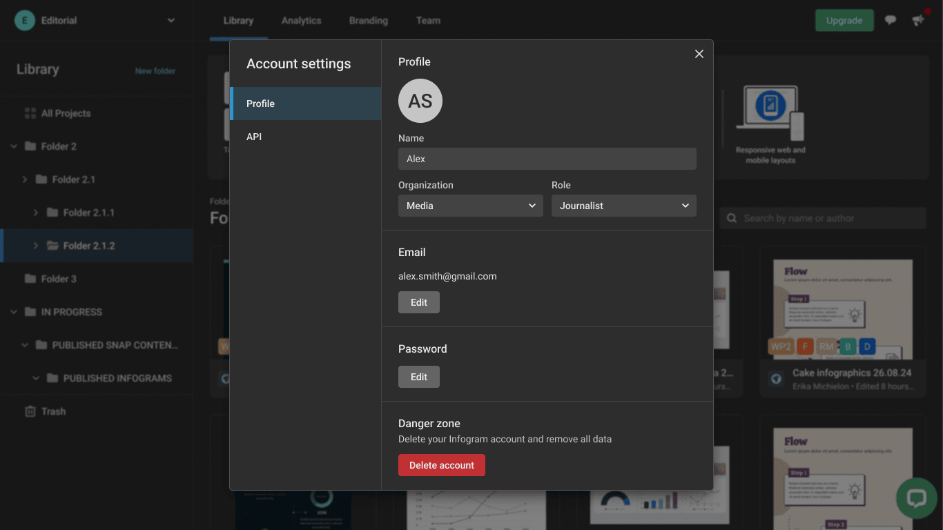
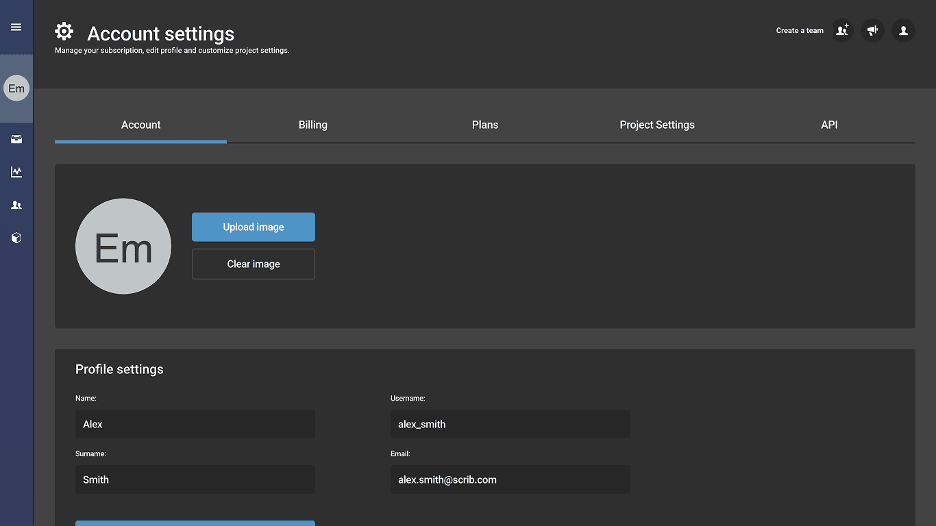
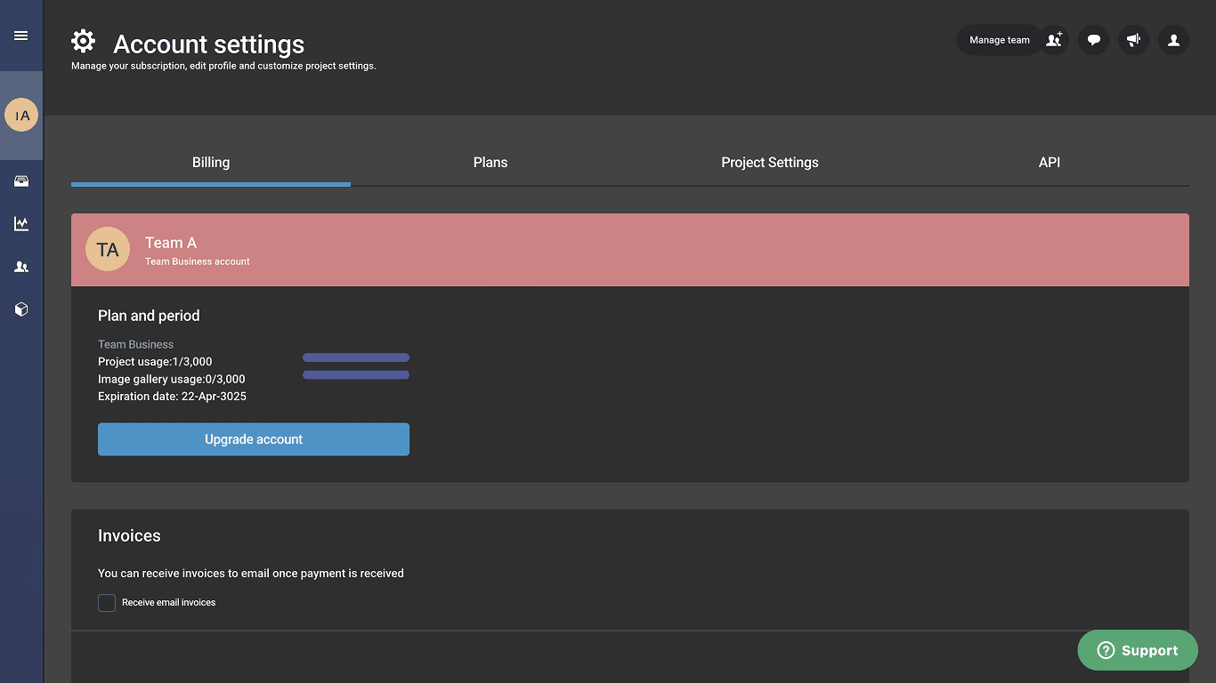
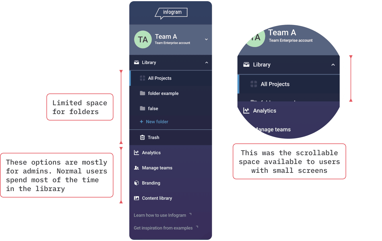
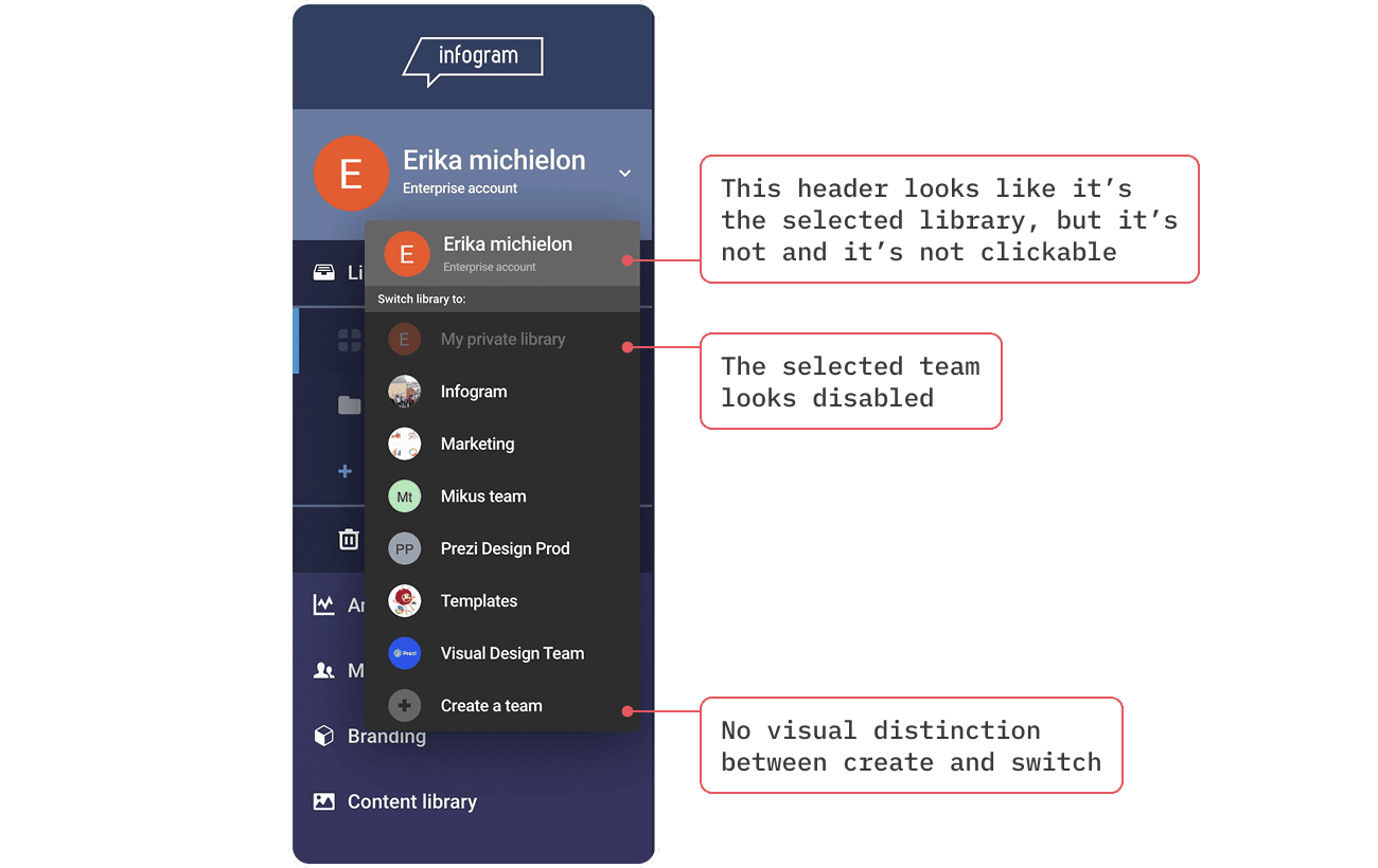
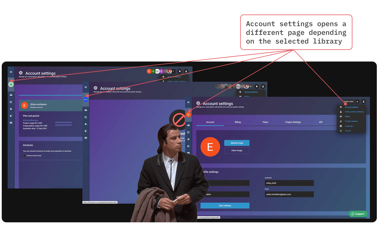
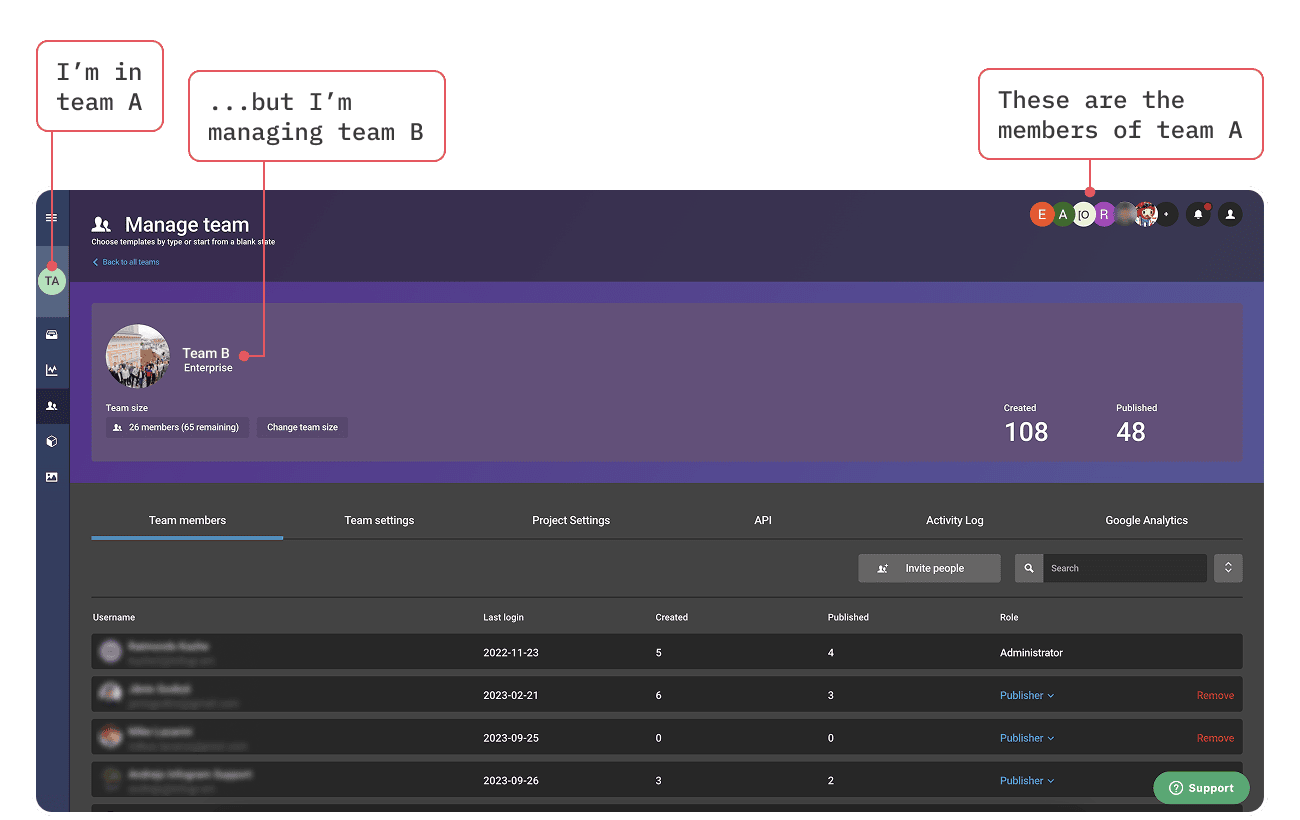
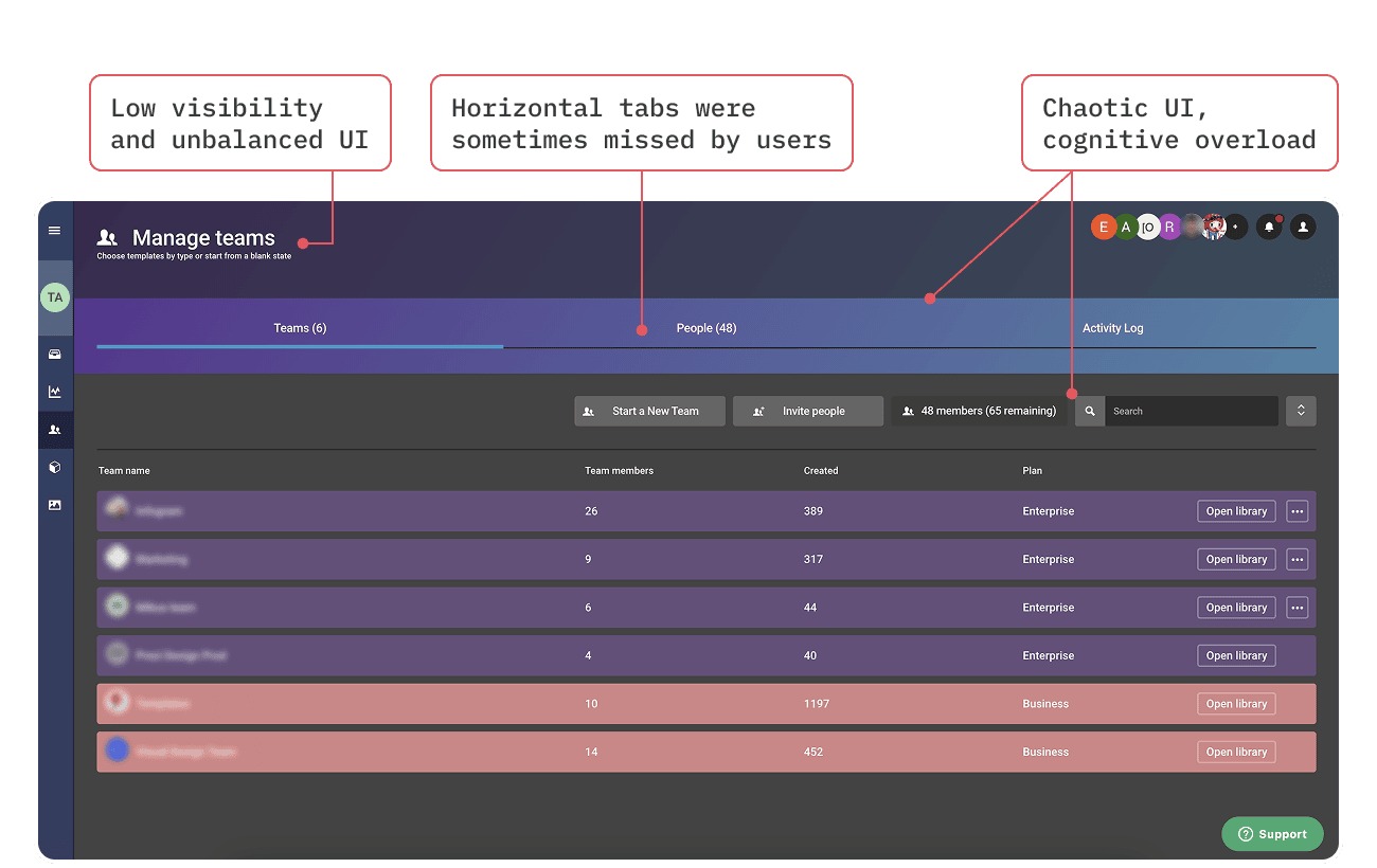
In 2023, while running user interviews for unrelated features, I started collecting side notes on evidence of confusion around several parts of the dashboard. I then prepared an internal presentation with the findings, to propose a redesign initiative. Here are some of the issues identified:
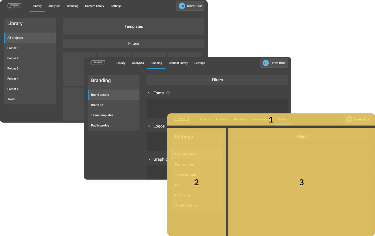
The presentation also included an analysis of information architecture and a couple of proposals. One with vertical tabs in all pages, close to the existing layout, and one with a horizontal navigation.
Waiting…and testing
That initial presentation was well received, but with other initiatives taking priority, the PM, EM, and I agreed to postpone it to a better time.
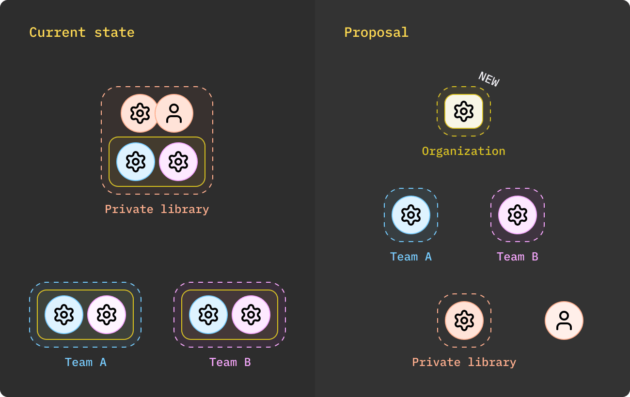
By May 2025, that better time had not arrived yet due to other emergencies (we were without a PM, and AI had stormed into the roadmap), but more reasons to work on the dashboard had piled up:
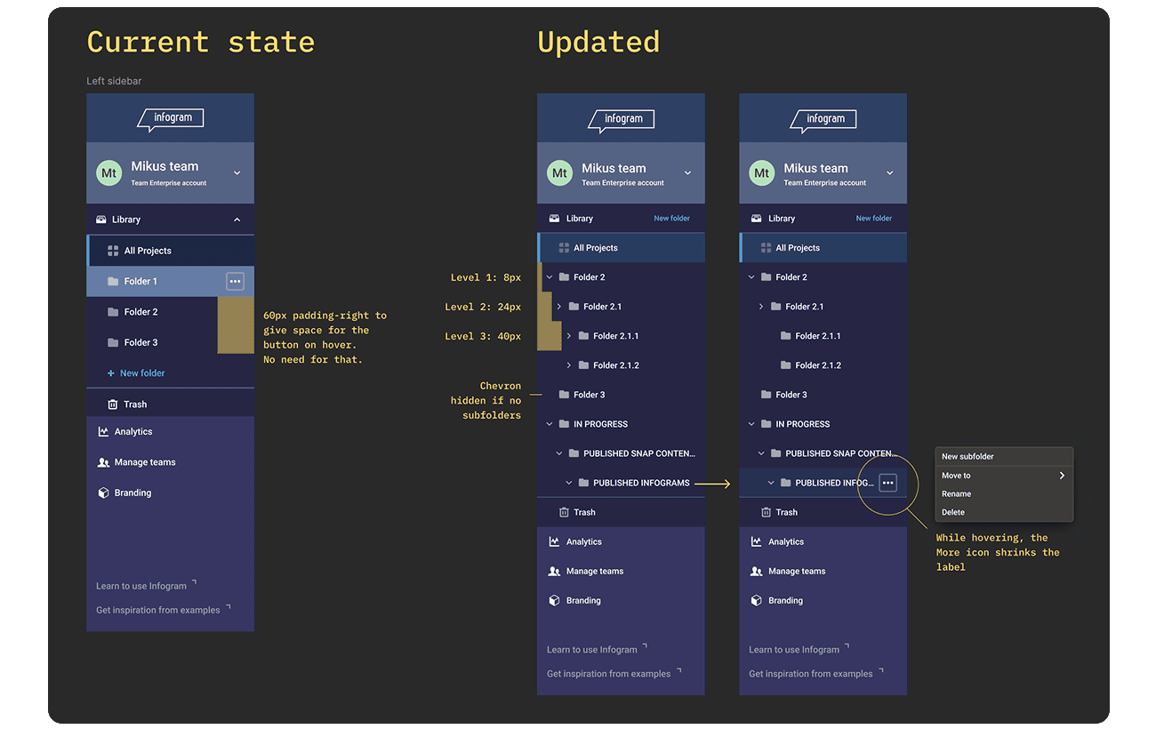
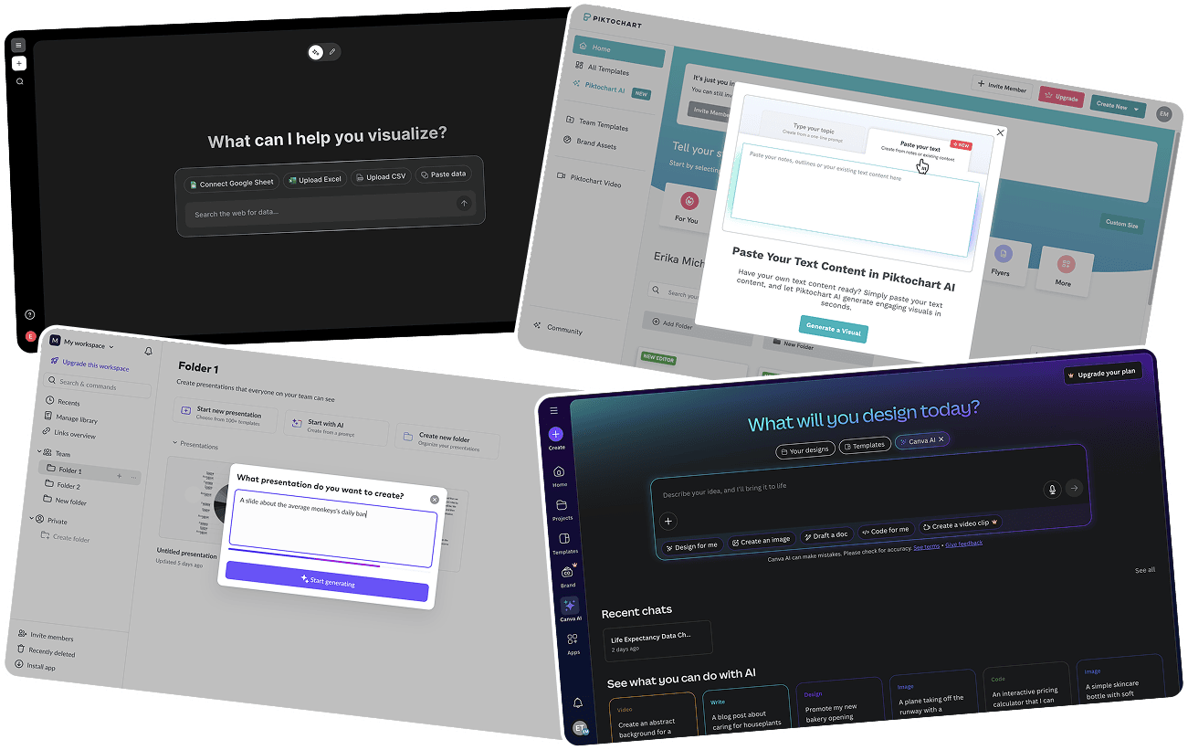

I made some time for creating a couple of prototypes with the main flows and gathered feedback from across the team: developers, customer success, customer support, QA, and Prezi design team. After a few iterations, I involved our UX researcher to set up qualitative tests in Lyssna to validate the new dashboard architecture and have data for when we would have time for it. We ran an AB test with a series of small tasks to complete on either the current or new dashboard, targeting existing admin users recruited through customer success.
The main goals were to:
- Confirm that the new dashboard was faster to navigate, and that both new and moved flows (like the Organization section, team switcher, and profile) were easy to discover.
- Check how the new look and feel would be received
- Spot potential issues we hadn’t anticipated
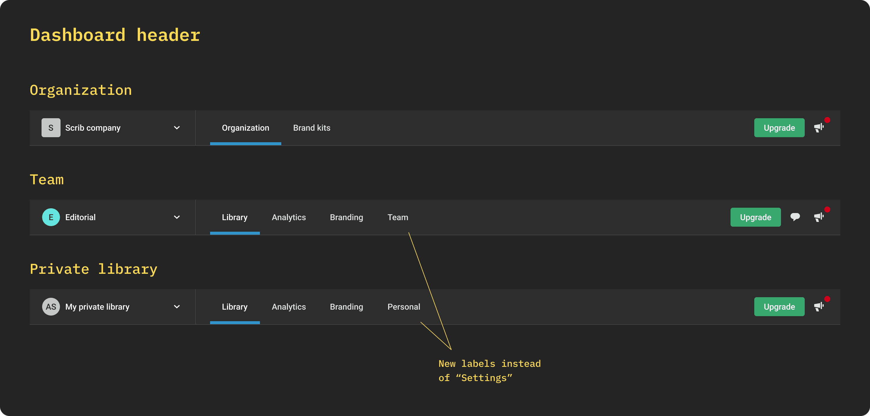
The first rounds surfaced one recurring issue: each of the three workspaces (Personal, Team, and Organization) had a menu item labeled "Settings," so users assumed it was the same everywhere. In reality, each workspace’s settings held different content, so we relabeled them to make the distinction clear.
Everything else showed no major issues, with overall shorter time-on-task and higher completion rates.
Planning
During the summer of 2025, better times had finally arrived, and we kicked off development.
I started working closely with Aleksejs, the developer most passionate (and annoyed) by the existing dashboard issues. His experience with how things worked (or not) under the hood was fundamental to designing the final screens.
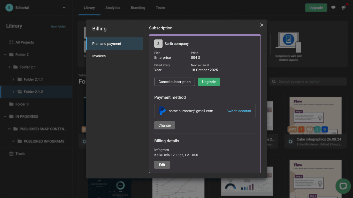
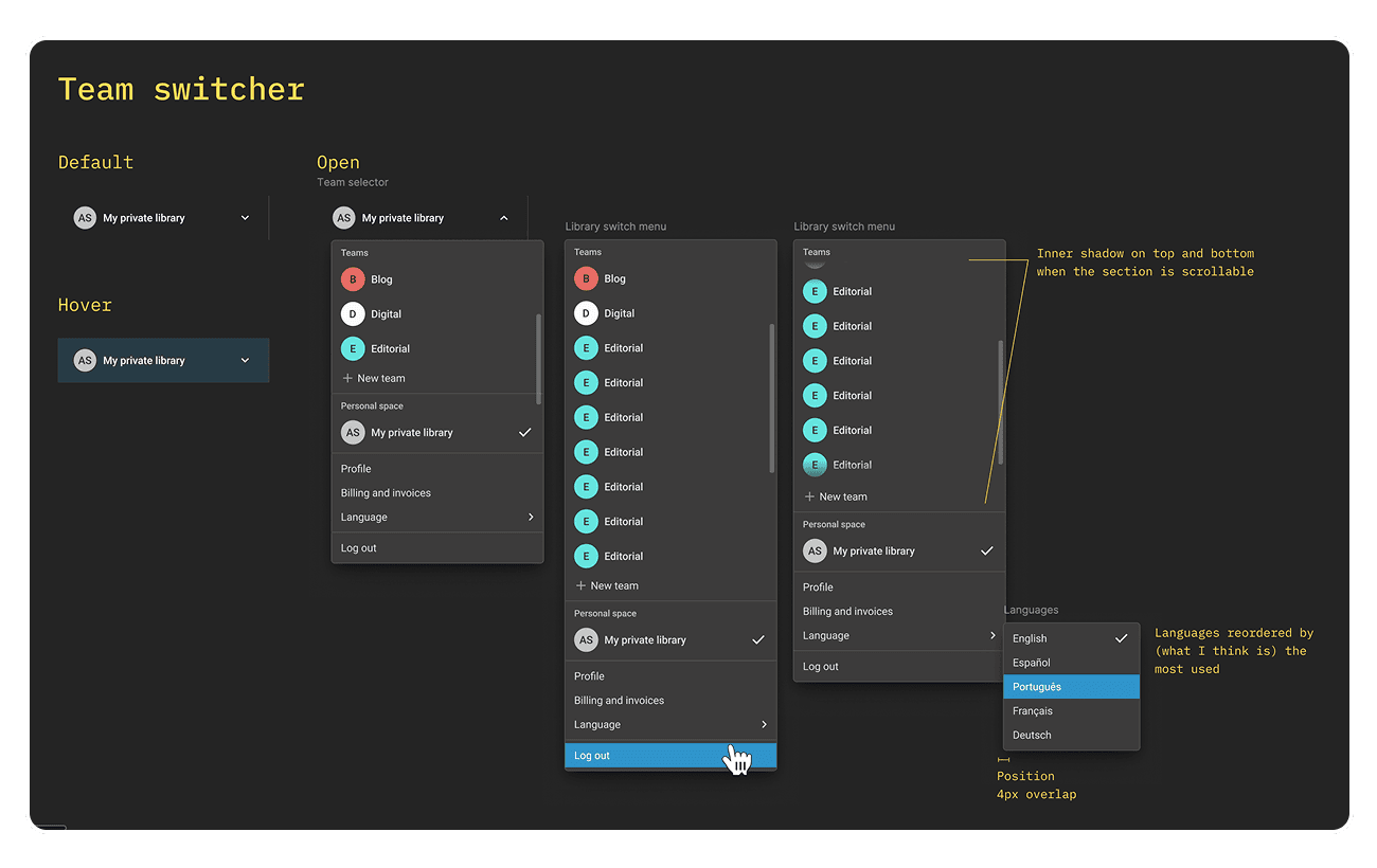
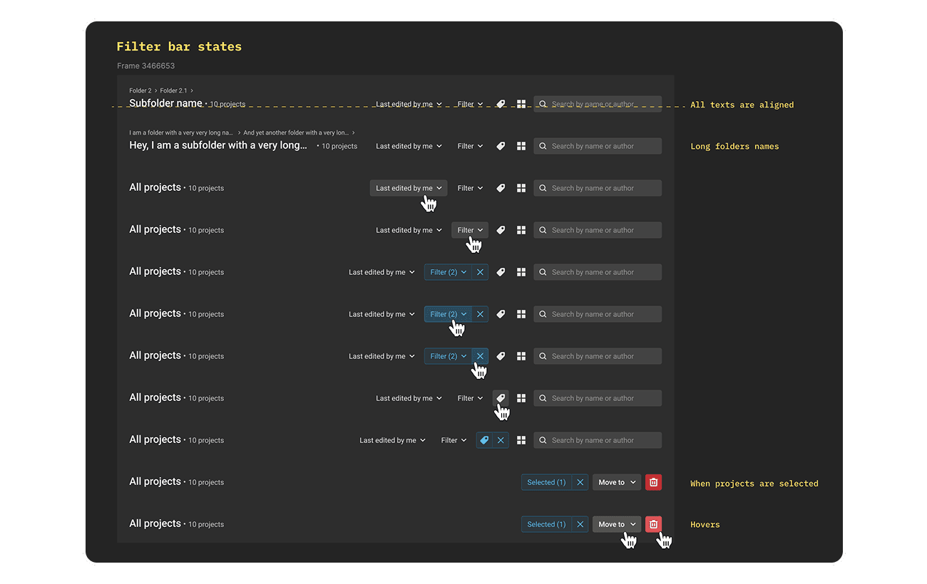
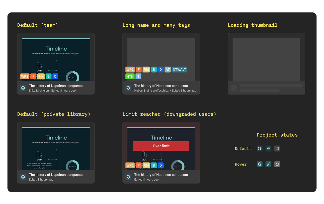
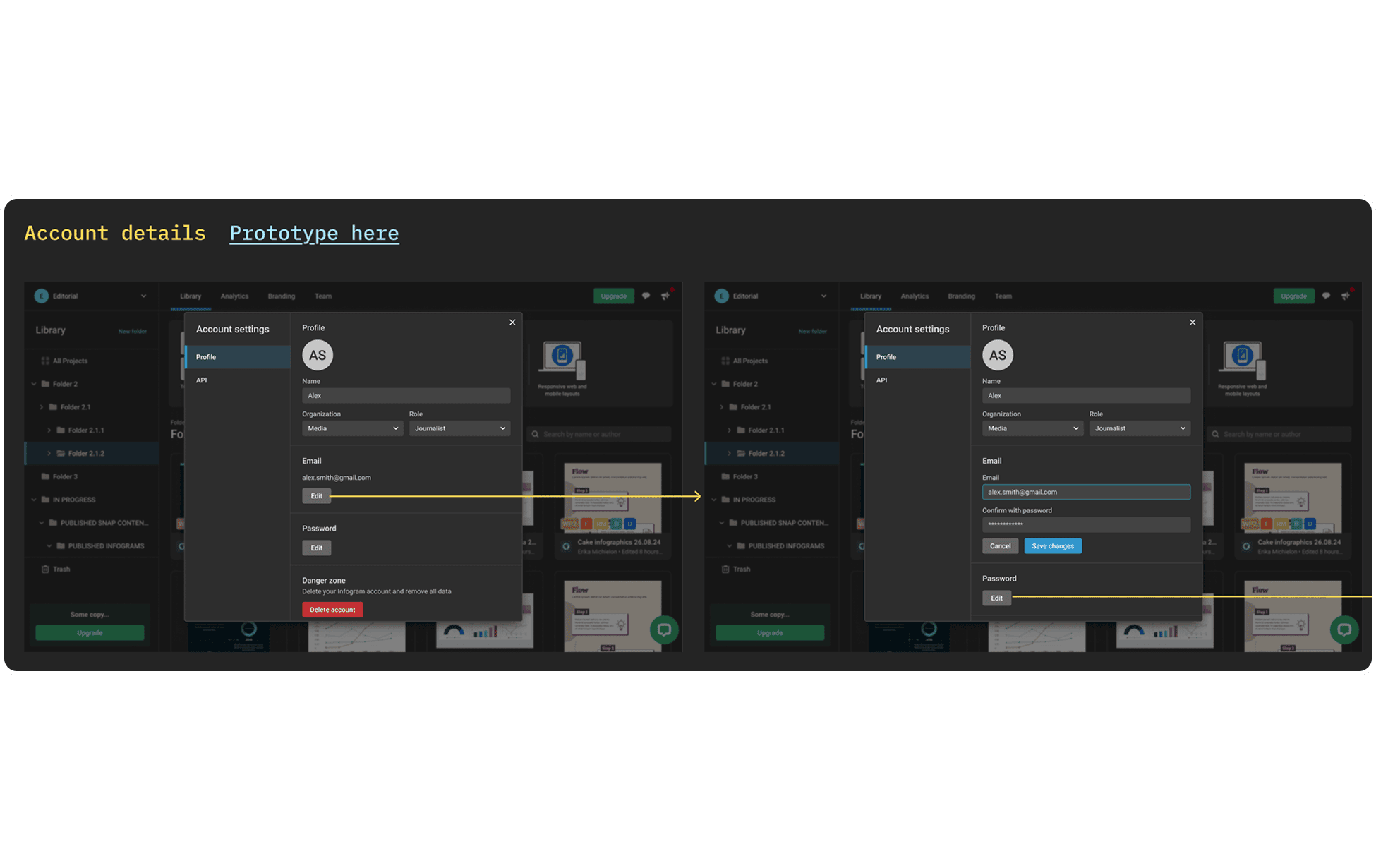
As engineers began the work, I prepared a Mitzu dashboard to keep an eye on the upgrade buttons (not because we expected an increase, but to make sure we weren’t breaking anything), while also preparing high-fidelity screens, going deep into flows and documenting UI details. Here are a few:
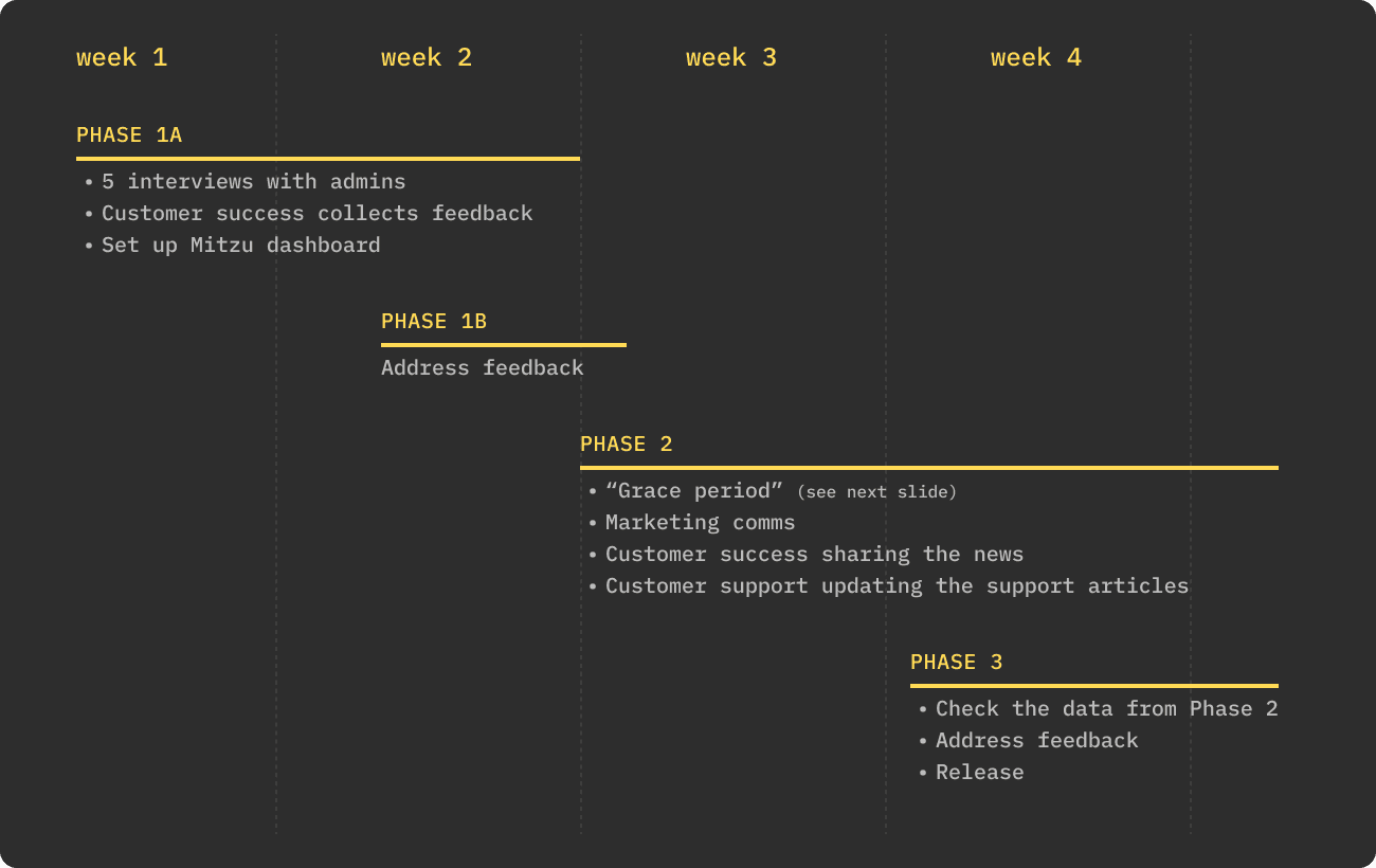
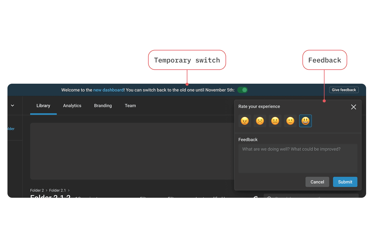
As I was spearheading the initiative, I also defined the release plan, which started when development was almost complete:
Outcome
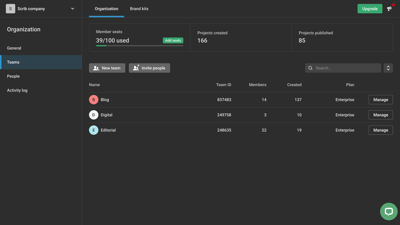
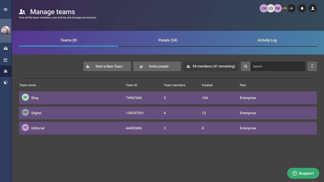
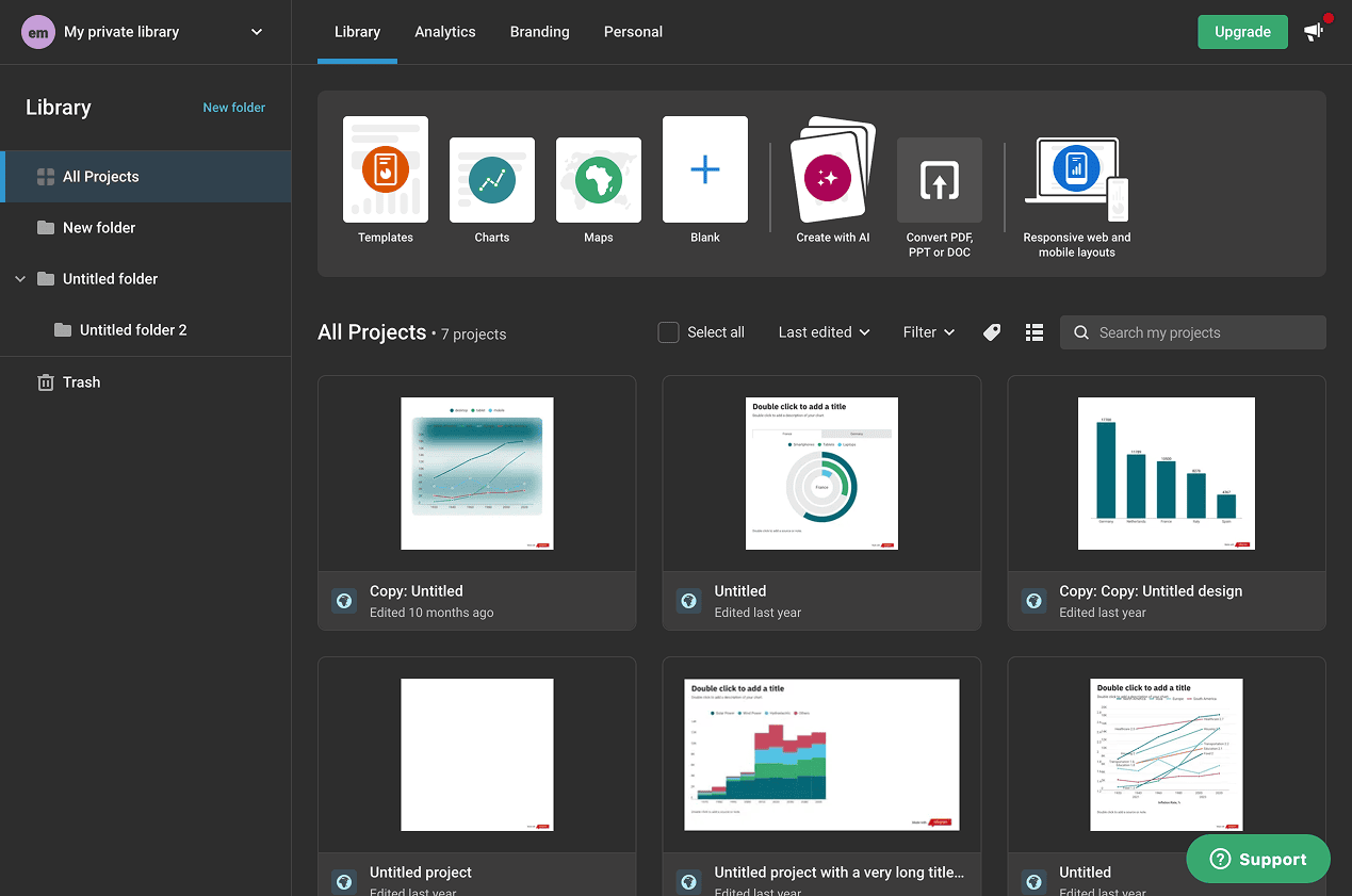
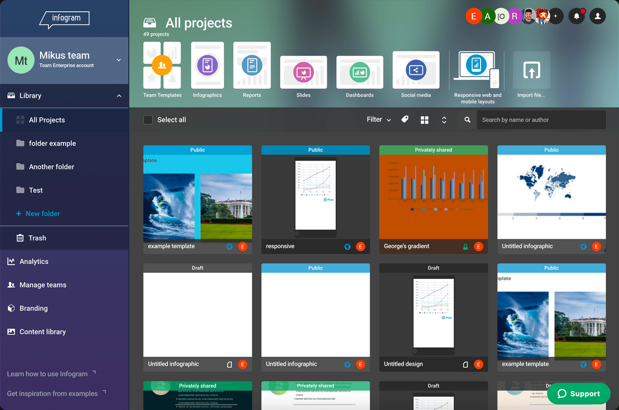
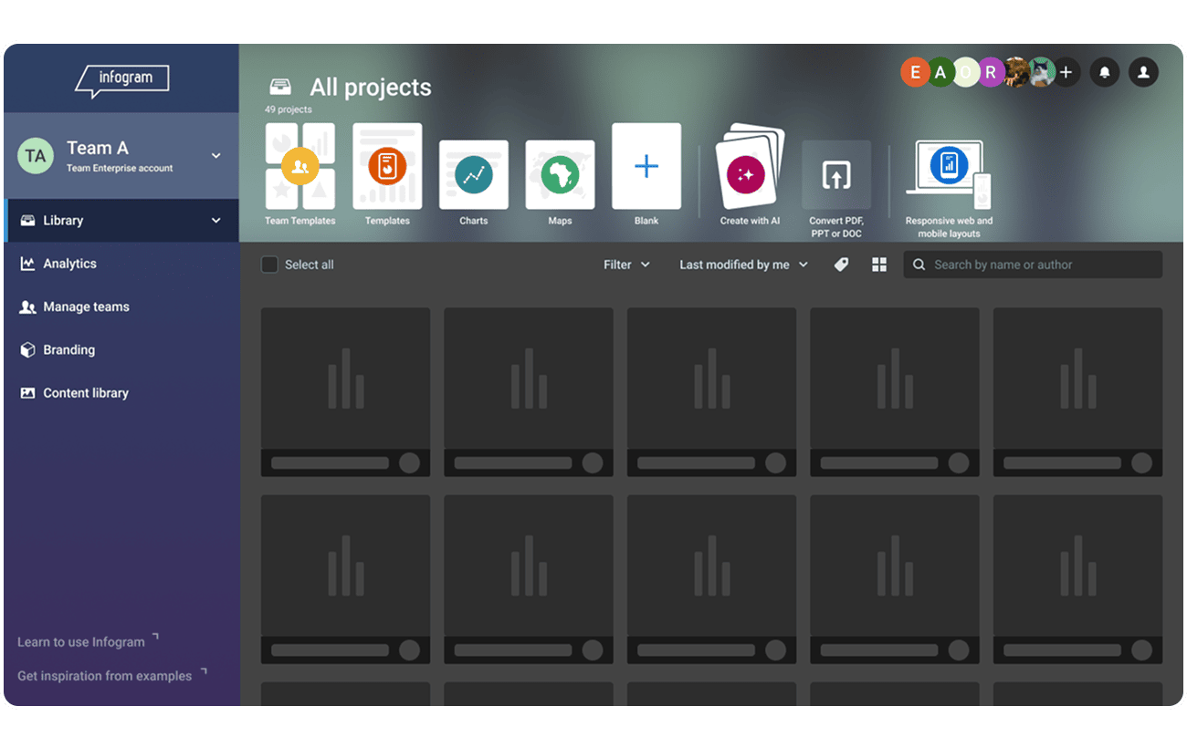
We barely made it in time to complete and release the dashboard, when the company strategy changed and the team and I were moved from Infogram to building Swoop. What I could gather a few months later was that the previously hidden sections became more discoverable, with +12% YoY clicks on the top menu. Navigating the dashboard is now noticeably faster, and Admins have an easier time managing their organizations. I’d love to confirm the impact with a drop in Customer Success and Support tickets related to navigation, but we don’t have that data. So this is where my Infogram adventure ended, and I’m happy we left it in a better state.
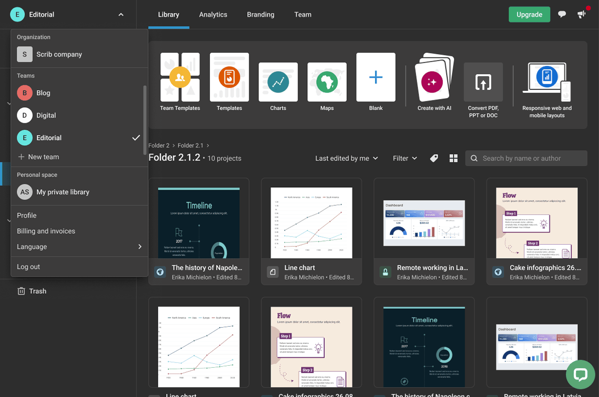
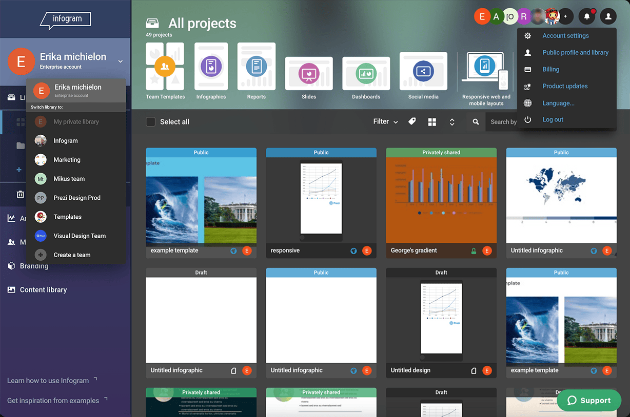
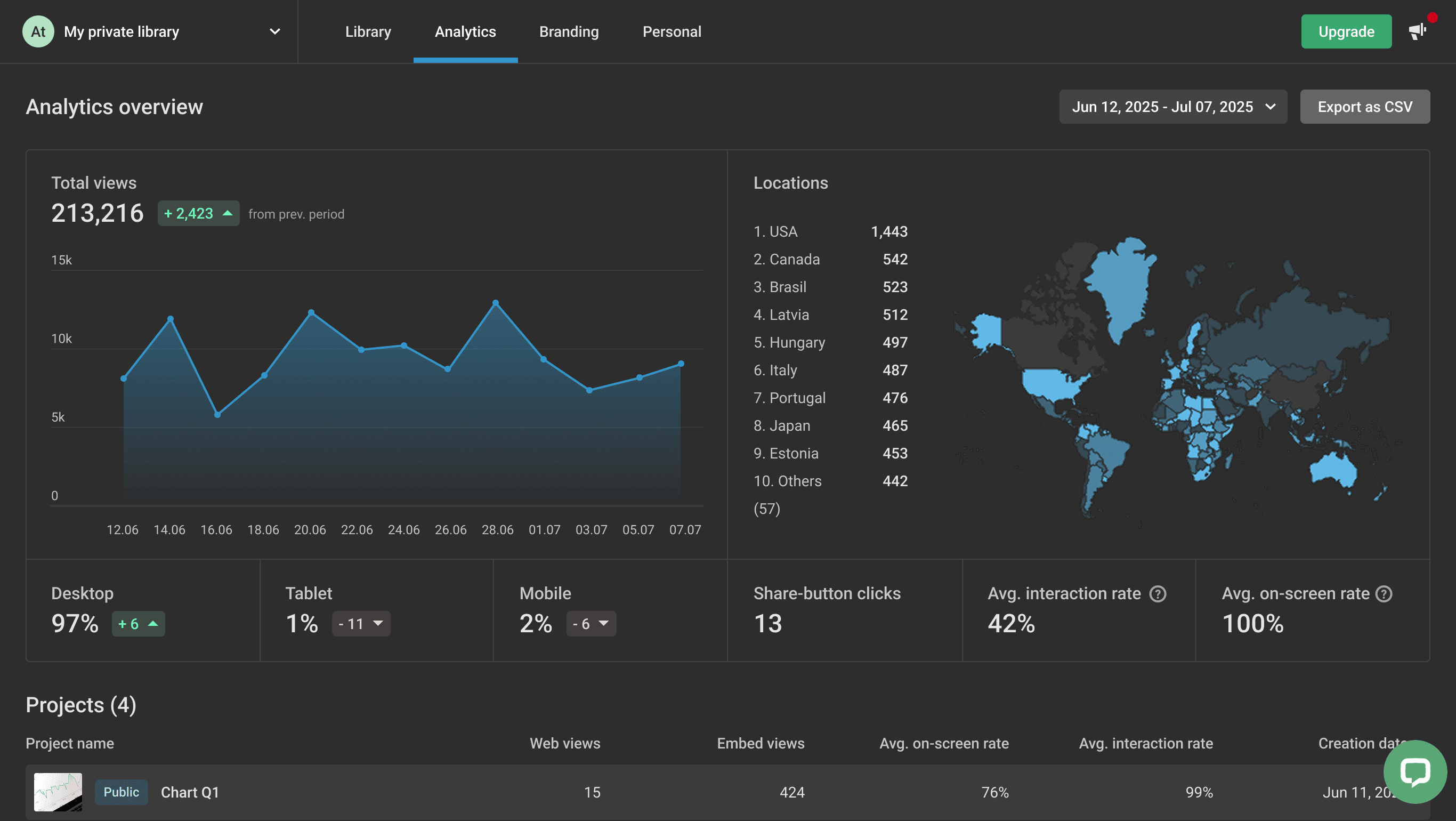
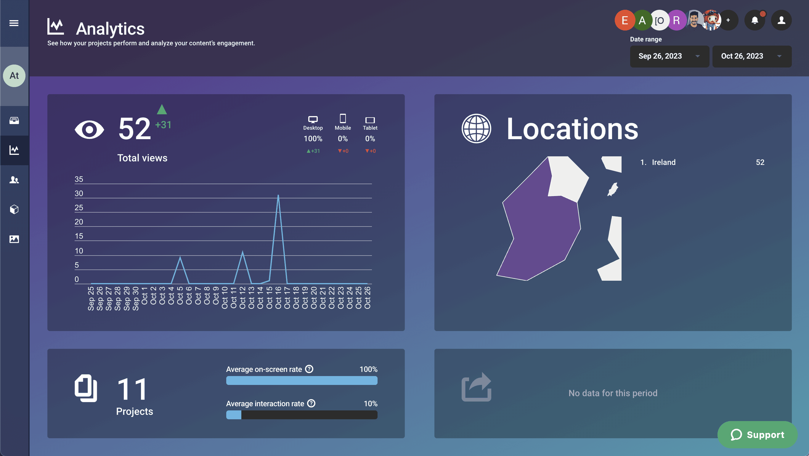
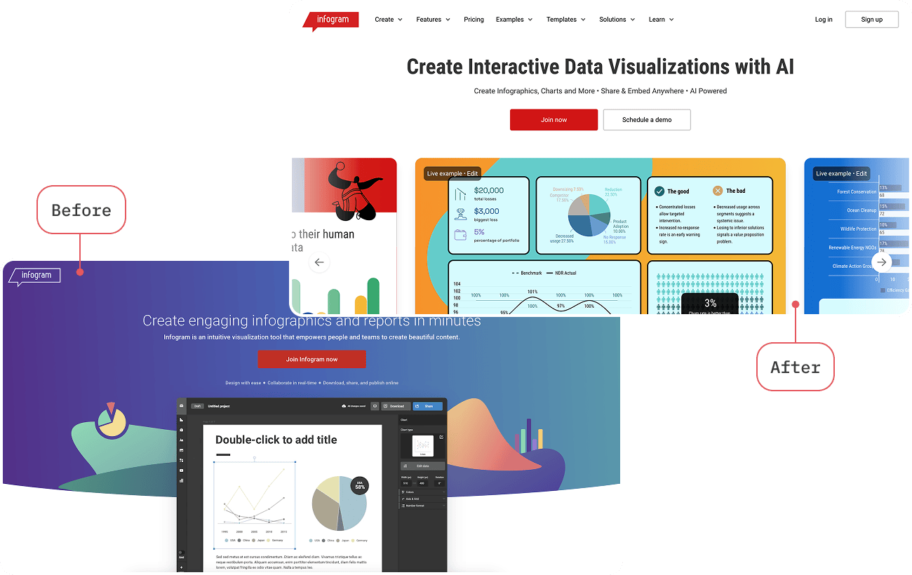
Here some before and after: