Bluebie, a shared grocery list for my household
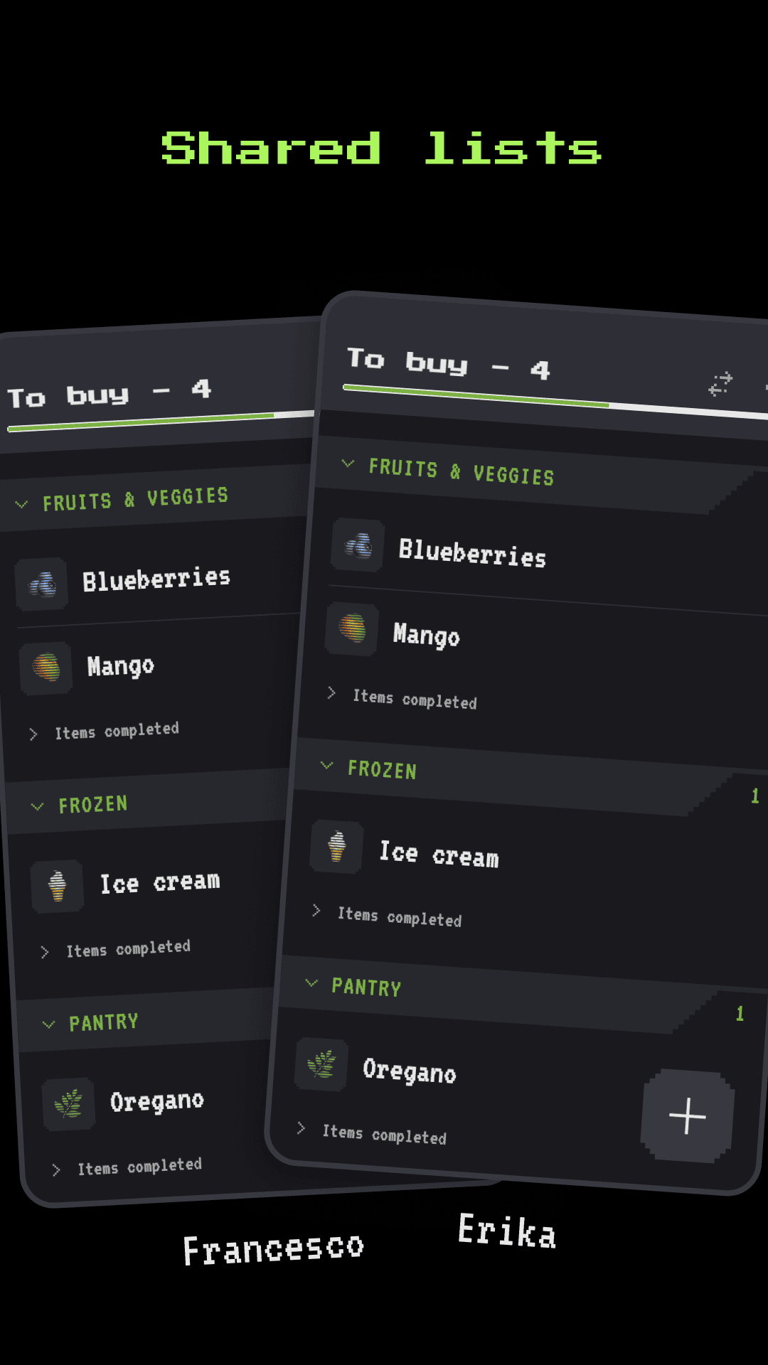
- My partner and I needed a synced grocery list to add and remove items each from their phone. I took this as an opportunity to built my own app with Claude as my only teammate.
- Team
-
- 1 product designer (me)
- My role
-
- UX/UI
- Branding
- Icons & copy
- Animations
Problem
Why?
There’re plenty of list apps out there — most pretty standard and kinda boring, some cluttered with ads, some paid. I wanted one that would bring me some joy when doing groceries, and I wanted to test what I could single-handedly do with Claude. Also, for the glory, I hadn’t made a mobile app before.
Sweating the details
I wanted a video game feel, but not too much, to avoid people actually thinking it’s a video game when seeing it in the Store.
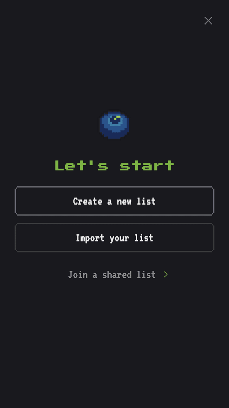
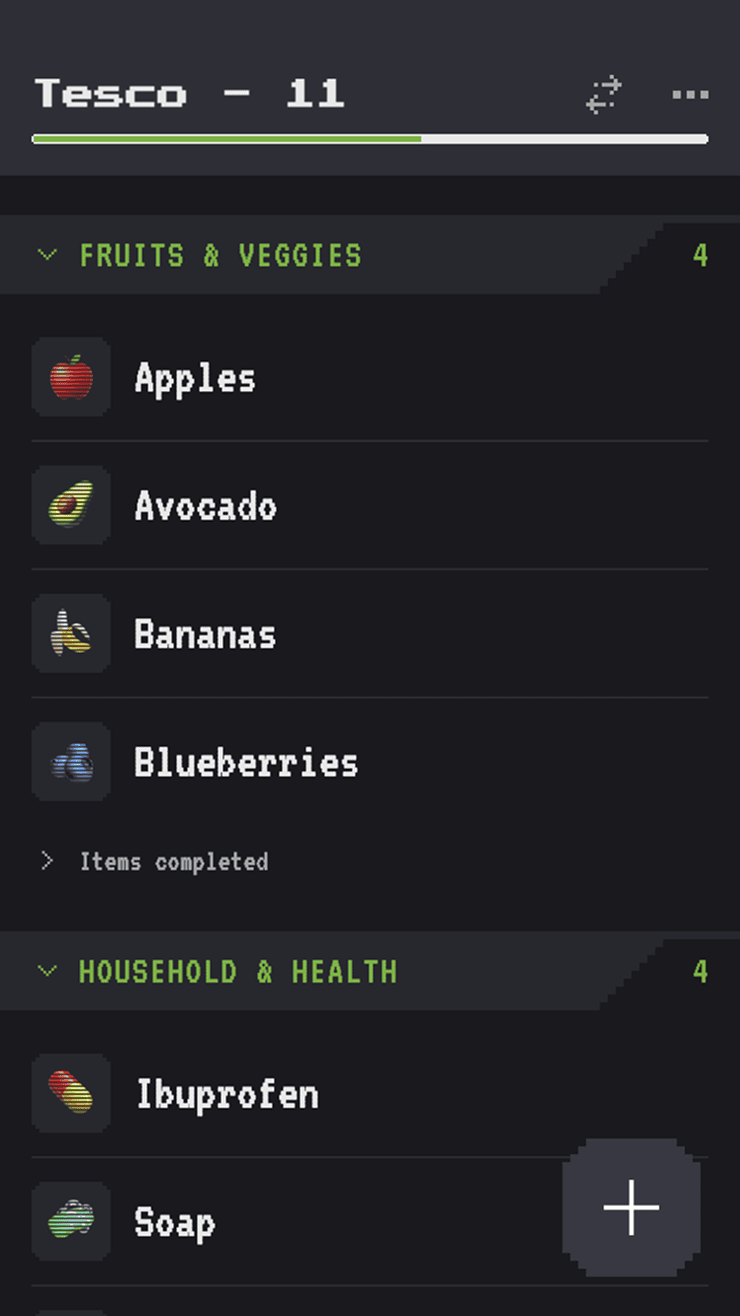
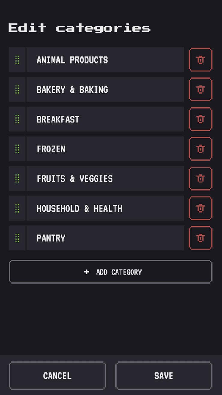
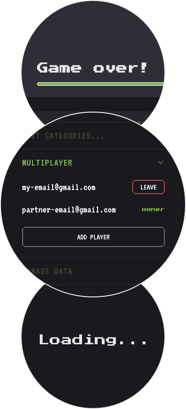
At first I wanted to create the visuals for list items in a pixel art style, but I realized I couldn’t know all the possible items people would have in their lists. So after looking for pixely filters, I landed on a less-appealing but more scalable solution: simply using native emojis, with some CRT-like lines to give the retro feeling.
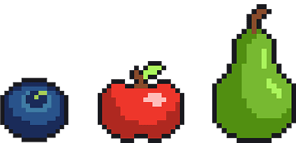

To surprise and reward my partner for buying distasteful but healthy food, so I added a way to spark some joy when checking items. Our household registered a +25% increase in monthly spending on carrots.
Item-editing actions are revealed on horizontal drag, like in Gmail and many common apps. But after spending a good minute observing a friend pressing and waiting in confusion for something to happen, I added a long-press interaction in addition to the drag.
UX choices
The main value of Bluebie lies in putting together a whole list of the items you recurrently buy, and reusing it over and over, so you only set it up once. Since adding items one at a time can get tedious, I built a quick list setup. And for manual entries, common items come with a predefined emoji that’s automatically inserted after you type the item name.
Process & technicalities
It took a few months, working a few hours on the weekends, with me, myself and AI.
It was one of my first projects where Figma was mostly a sketch pad for ideas and not polished mockups. I used Pixquare for the pixely icons, Claude for coding, Firebase for storing the lists, Google auth for accounts, and Vercel for hosting.
Branding
Bitlist, Pixlist, Baskit, Stakit, Grabit, Blooli, Bloopi, Blubi, Bluet, Bluva, Bloobit, Bloomi, Berrly, Bluebit… I spent quite some time on the naming, brainstorming with ChatGPT and its horribly generic suggestions, until we finally focused on something that would fit the blueberry app icon. We landed on a made-up word, with a very cute sound (imho), verified that the domain was available, the competition space clean enough, and off we go: Bluebie!
Conclusion
Bluebie is up and running: my friends and I have been using it with our partners to manage groceries for months now. I’m currently in the process of publishing it to the Google Play Store, which requires finding 12 testers to try the app for 14 days before it can be approved for production.
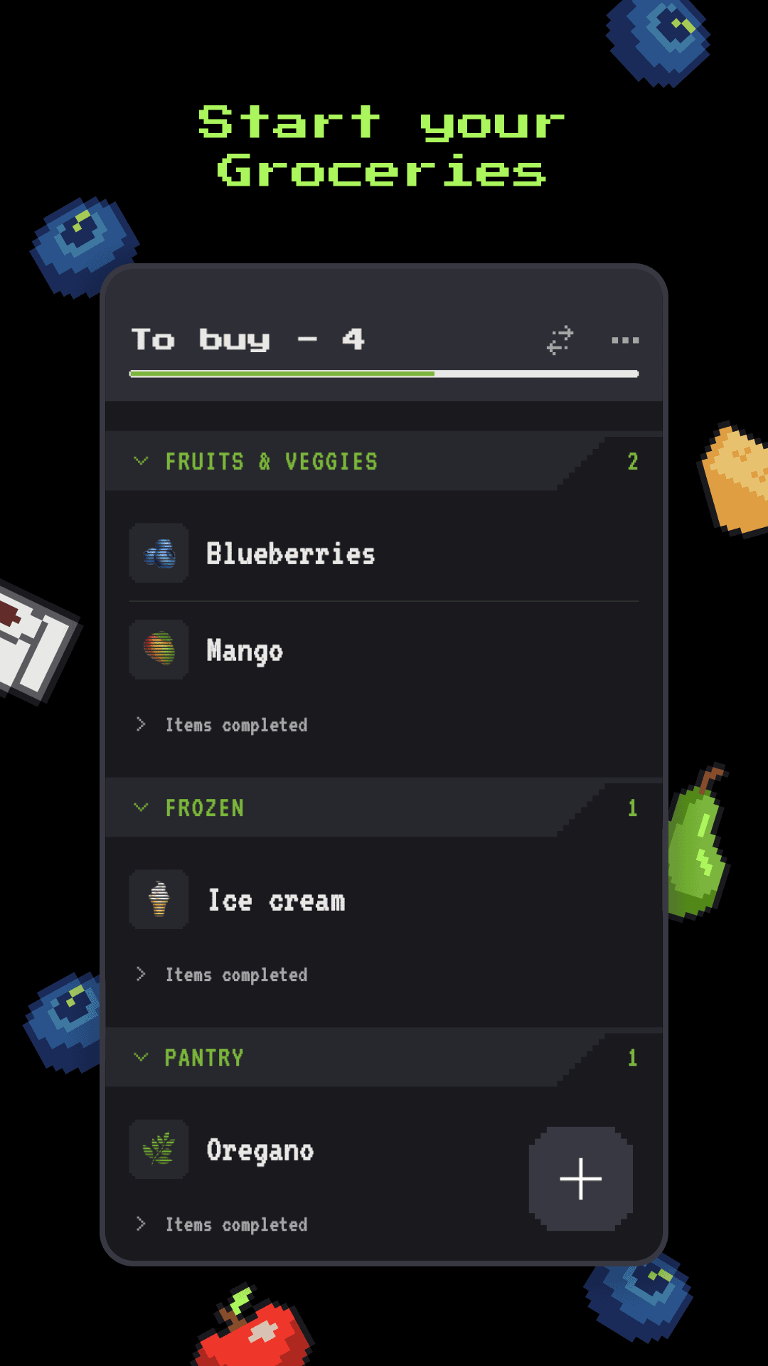
Easter egg
In a couple of screens there’re some floating icons (the pixely ones I didn’t use for the list items). If you click or long-press on them, they’ll respond to you.