Infogram editor: miscellaneous
- Infogram is a B2B platform for interactive data visualization. I was its sole designer from 2022 to 2025. This isn't a single case study but an overview of some of the things I worked on, from the editing experience and charts to the design system.
- Team
-
- 1 product designer (me)
- My role
-
- UX/UI
- Design system
Overview
Design system
I joined Infogram in 2022, when the product had just been revived after a few years of maintenance, with no active development. I had few Figma files to work with, mostly ported from Photoshop. I spent several months building a UI kit on the side while also shipping features. I rebuilt all the components in Figma to match what existed in code, reviewed the typography scale and colors, introduced semantic tokens, verified accessibility and added new icons. This gave me and the developers a reliable and consistent baseline to work with.
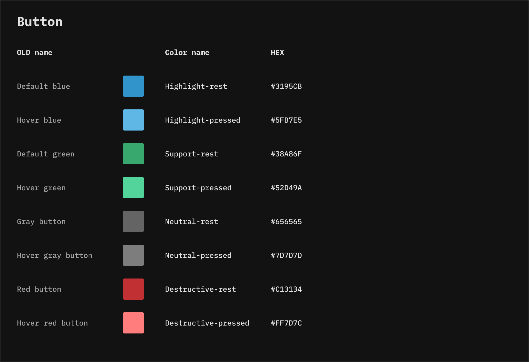
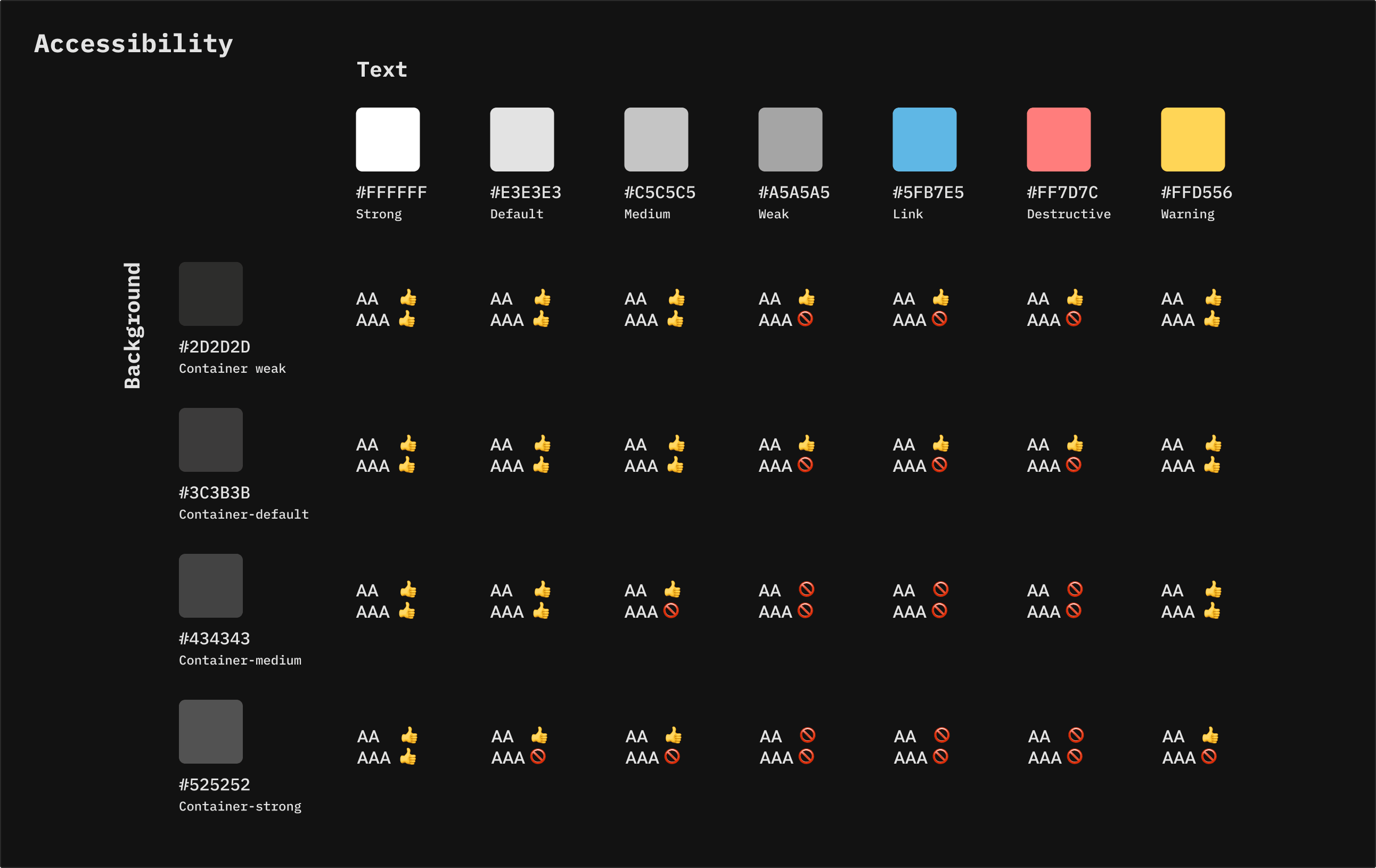
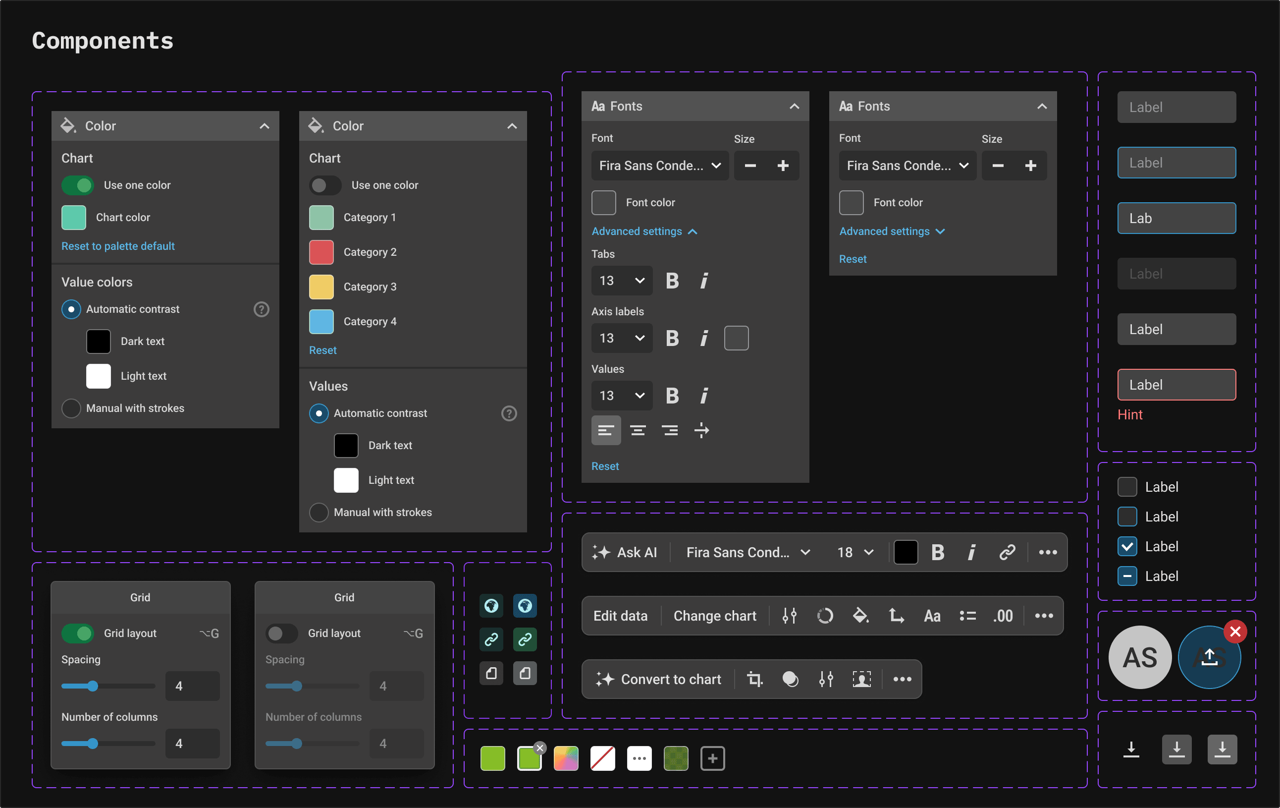
Color picker
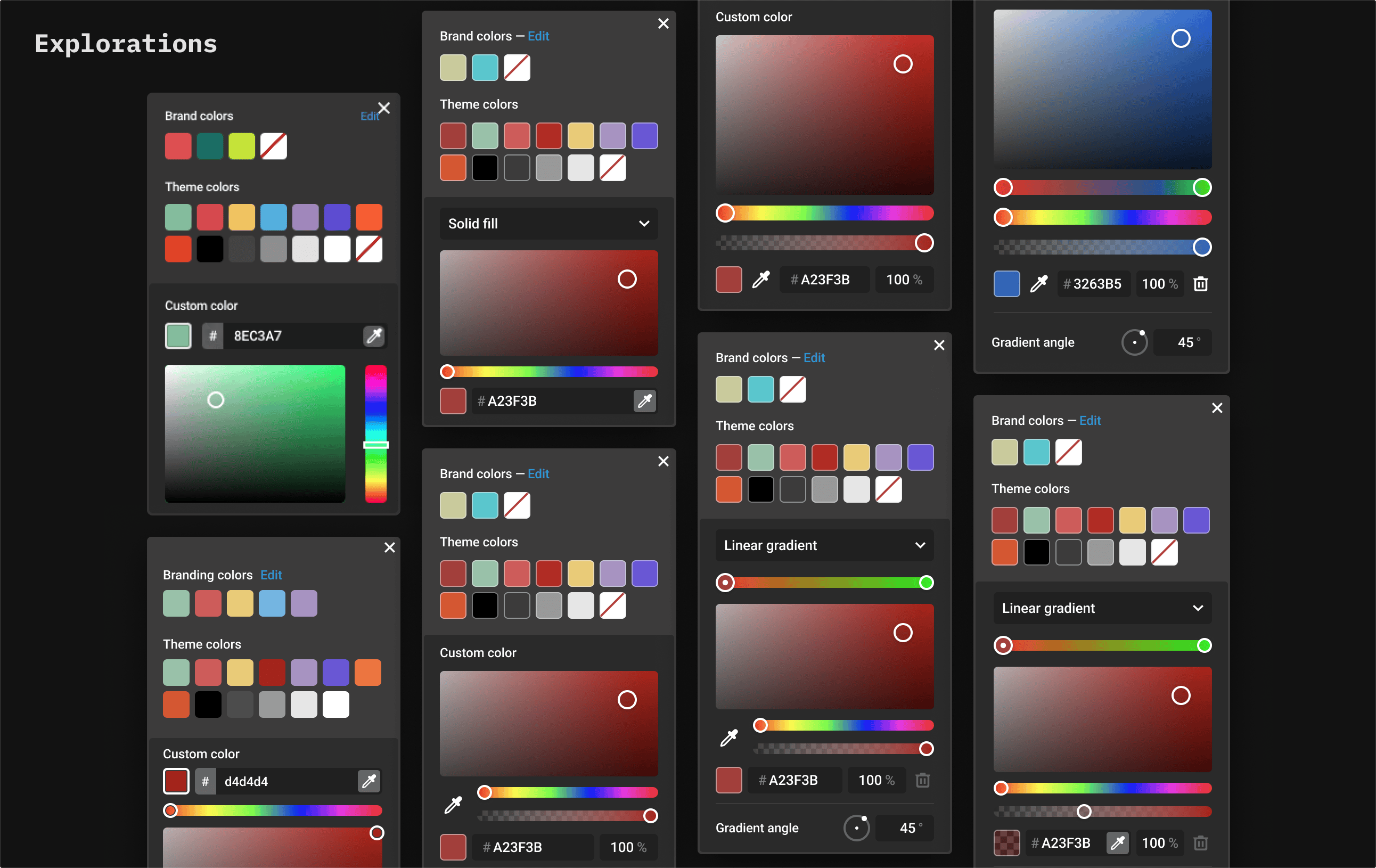
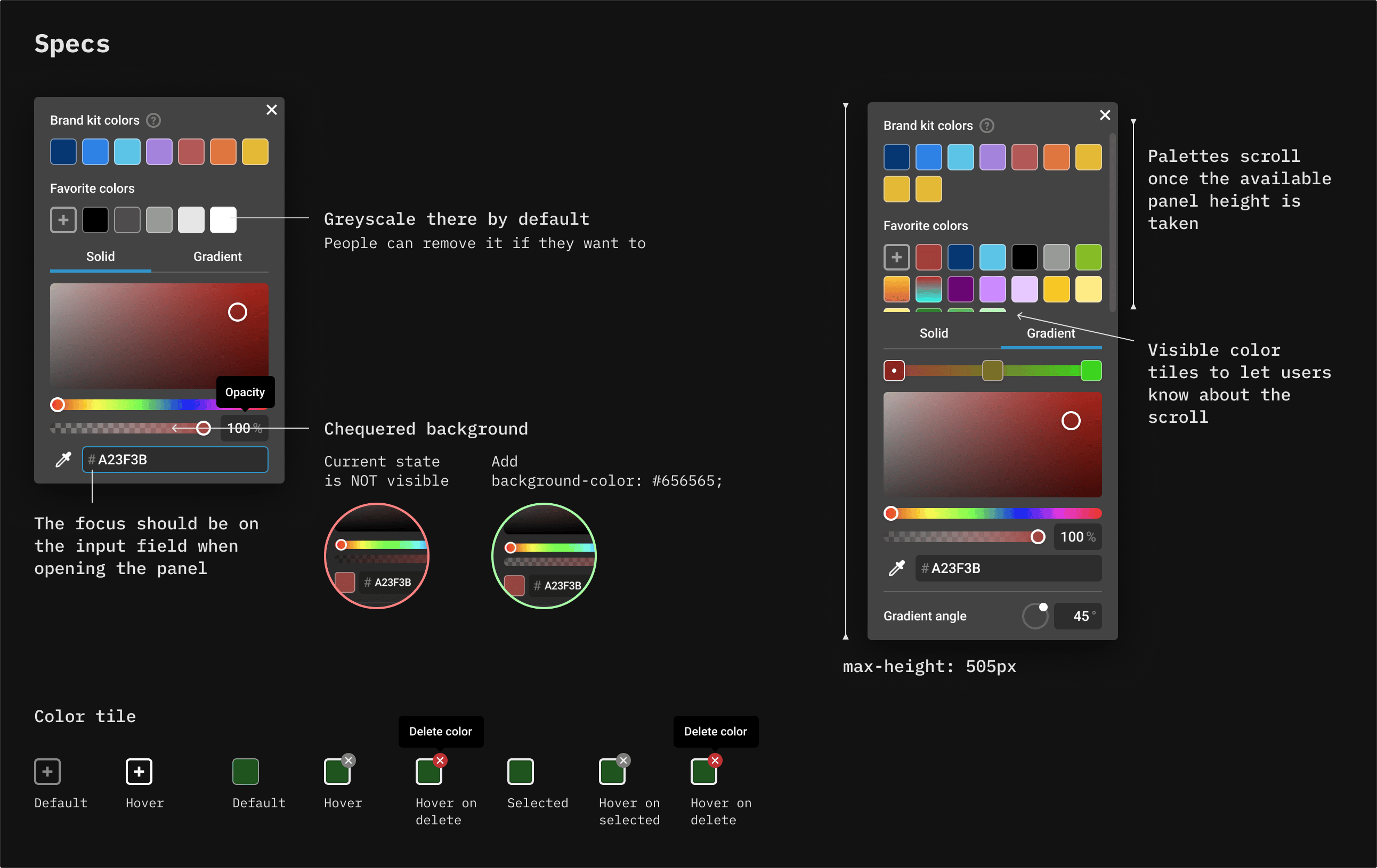
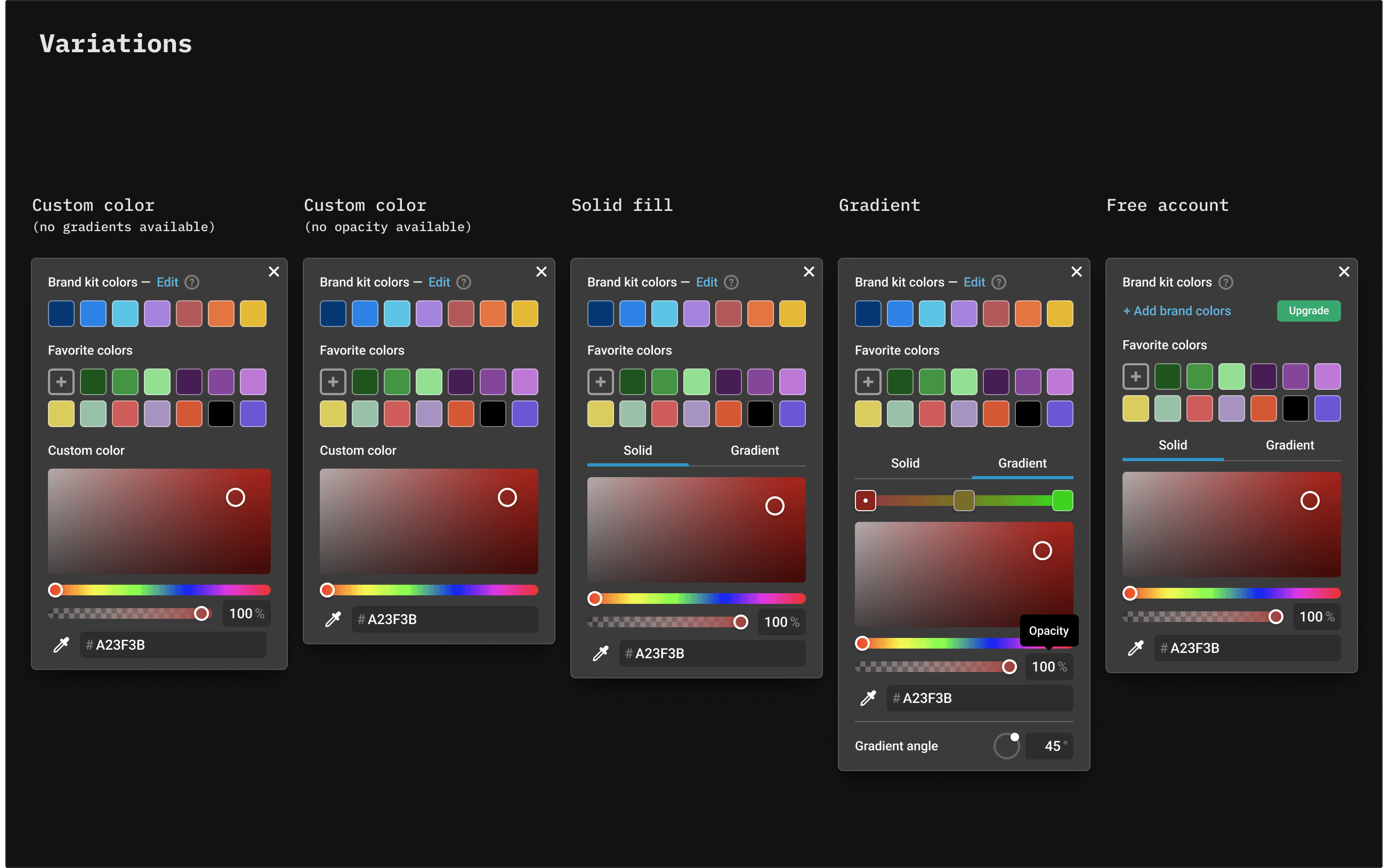
The existing color picker was limited to flat, solid colors, so the goal was to give users more flexibility. We needed to introduce gradients, opacity control, and favorite colors. I started with competitor research, then explored alternatives, collaborated with a developer, wrote technical specs covering every state, edge case and interaction, and ran a few usability tests with users.
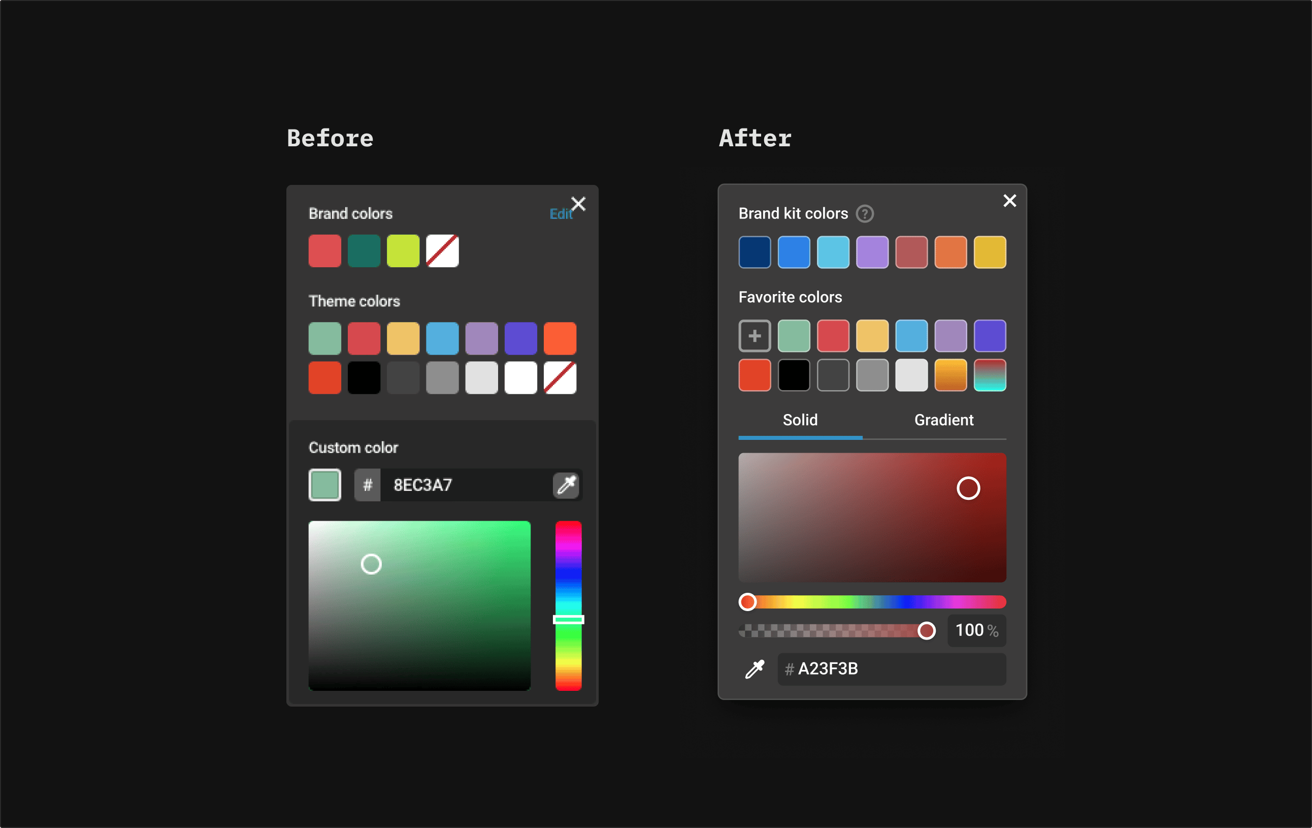
Signup flow
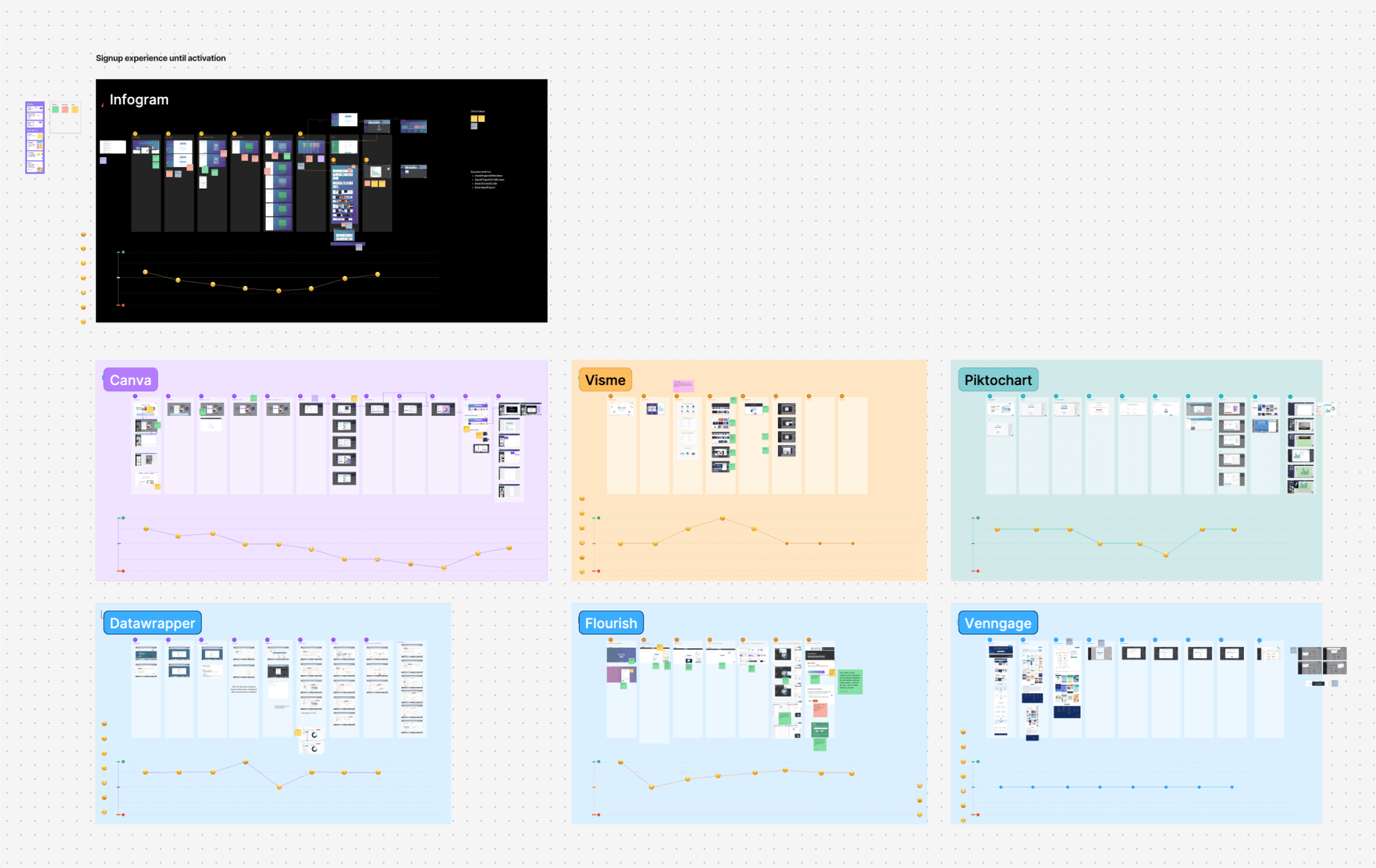
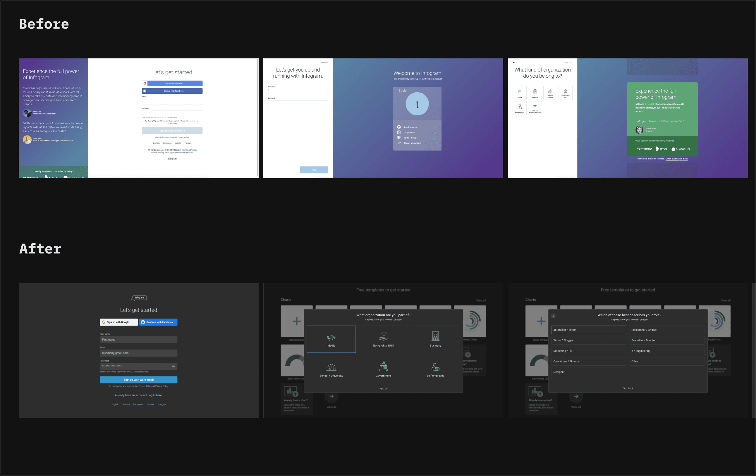
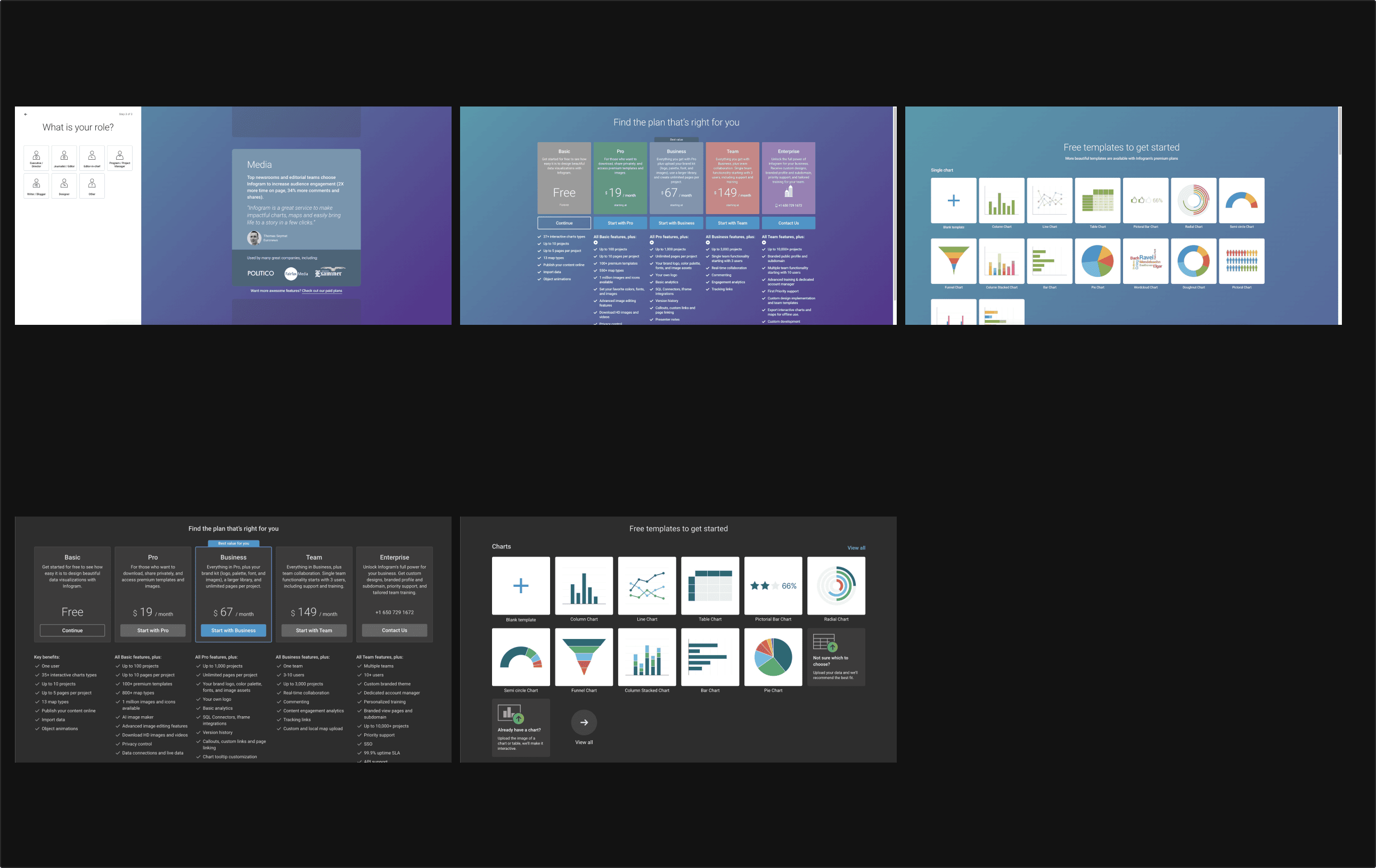
The goal was to review the signup flow to increase user activation. I started by analyzing the current state: mapping what different users experienced from each entry point (landing page, marketing pages, promotions and more) and checking how many users dropped off at every step of the flow. With the PM, we organized a competitor analysis workshop, and with the UX researcher we ran 7 user interviews. Based on the learnings, I made a few proposals, updated the UI, and worked together with an engineer to prepare the AB test. Unexpectedly, activation didn’t move, but bookings increased by 37%.
Work in progress: this article is still being written, and more projects will be added soon.